


Milanote is a tool in which you can create boards that are part mood-board, part strategic-plan. It has a clean and simple interface as well as many tools for customization, which allows for flexibility in content creation. The columns, organized by subject with topic cards, are reminiscent of Trello.
If you enjoy Milanote’s features and column-based design, with individual cards and boards that separate ideas by topic, but want something that puts more emphasis on the different connections between ideas, there are other options.
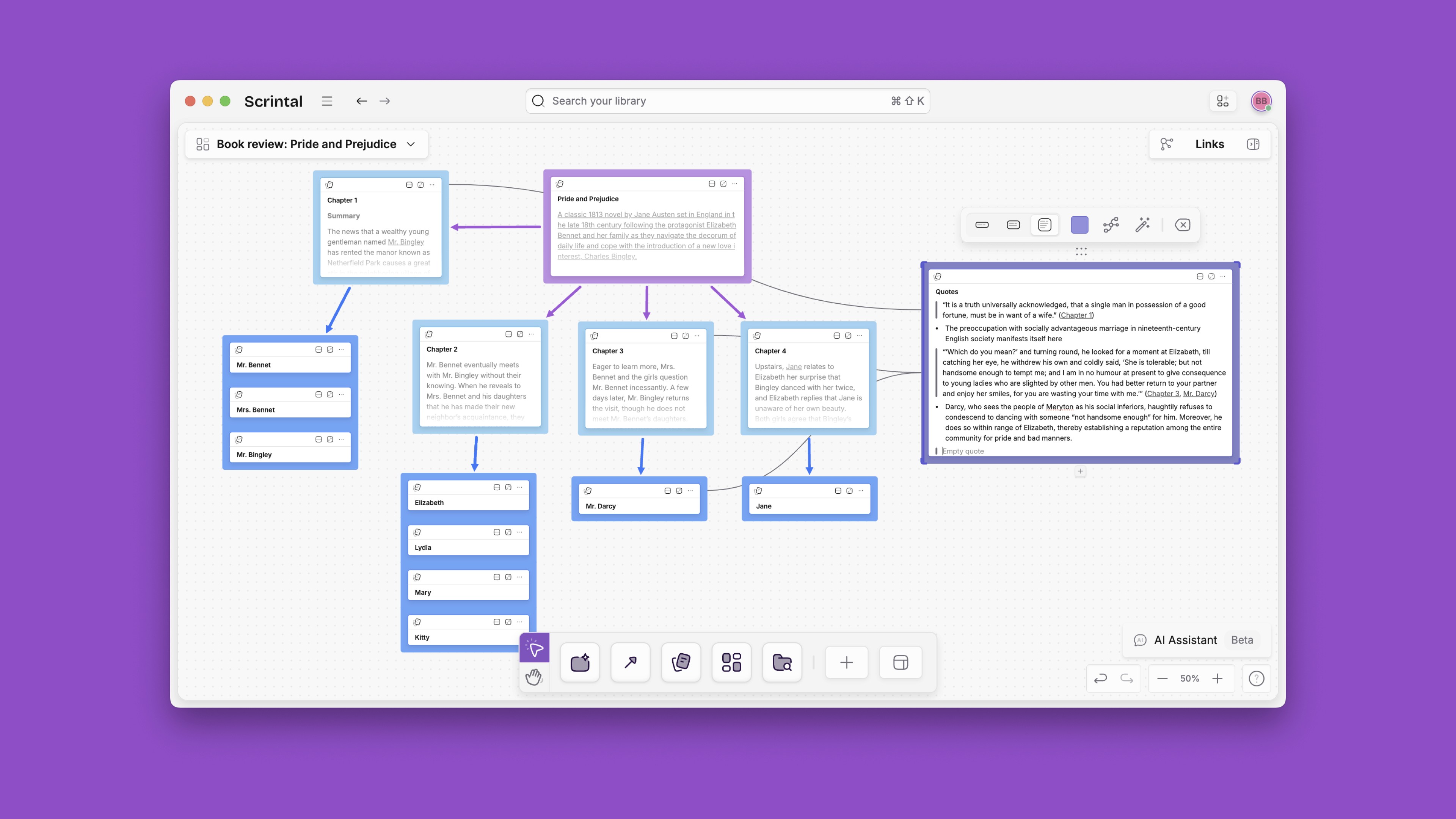
In Scrintal you can optimize the ideation and strategic processes with a whole map of your connections that can be customized more than simple columns. This allows you to see a different holistic perspective of your board that focuses on identifying new questions and areas of thought to create a more complete and thorough board.
In this guide I will introduce Scrintal by comparing it with Milanote and pointing out the best features of each, enabling you to choose a system for your needs.
Milanote Alternative: Scrintal’s Best Features
Personal Knowledge Management
With a personal knowledge management system, users can collect and create information to organize for more effective future use. PKM sounds daunting because of the breadth and depth of potentially relevant information, but with Scrintal you can organize information as it appears and make connections between topics.
You can also customize the visual display of this information: make clusters, trees, or intricate maps as needed, or dismiss and display notes as needed without losing the connections.
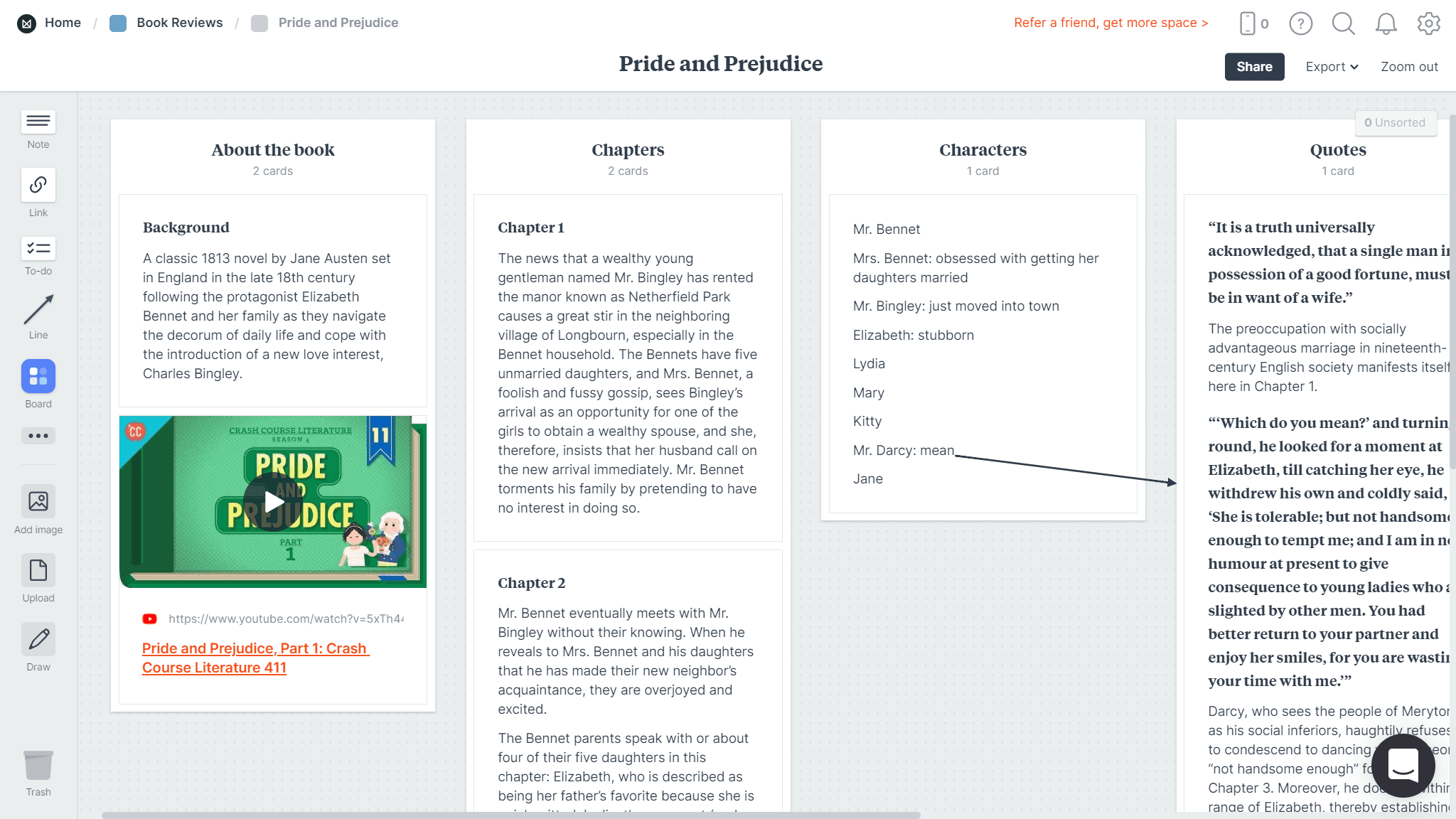
In Milanote, the collection of knowledge is done in a similar way (with cards), while the display is in columns; you can also create this column-organization in Scrintal, with blocks.
Scrintal’s spatial canvas is a critically important feature for mind-mapping, but it is far more than flashcards on a corkboard: there is no word limit for any card, and you can also embed images, videos, tweets, and PDFs to expand the potential for connections and remain within the Scrintal ecosystem. Backlinks to other cards and boards make related information easily accessible.
Milanote has many similar features, except that its connection system is more visual in nature: arrows are used to indicate connections between cards, but only external sources can be properly linked. In Scrintal, you can link to a doc (whether or not it is present on the desk or a board) or an entire board, enabling ease of access during creative ideation.
Connected Note Taking
In Scrintal, you can create networked connections between notes and edit them simultaneously. The same is true of Milanote, but cards only exist on the board and do not open in a new tab to edit; therefore, a card with a long paragraph of text will require scrolling to view the whole column, whereas, in Scrintal, you can choose between Compact, Snippet, or Full view of docs on the board. So you can fold docs to view titles only for a holistic overview of the board.
Being able to recognize the connections between different ideas inspires further creativity, which makes these features critical. Scrintal and Milanote both use visual representations to display the connectedness between notes; but in Milanote, the connection is purely visual and not linked. Scrintal displays the entirety of a particular map of notes using boards that differentiate topics, and connections are linked, allowing the user to open them while reading for easy reference.
Multimedia Detailed Notes
Milanote emphasizes media files as part of your board, so just like in Scrintal, you can upload or embed images, videos, and document files like PDFs. In Scrintal, you can open these media files in a new “floating” tab and drag them around your board, allowing you to read, watch, or listen to them while note-taking.
In Milanote, you can open multimedia files, but they take over your screen; you can view images and watch embedded videos (like YouTube videos) within the card instead, but documents cannot be read while note-taking.
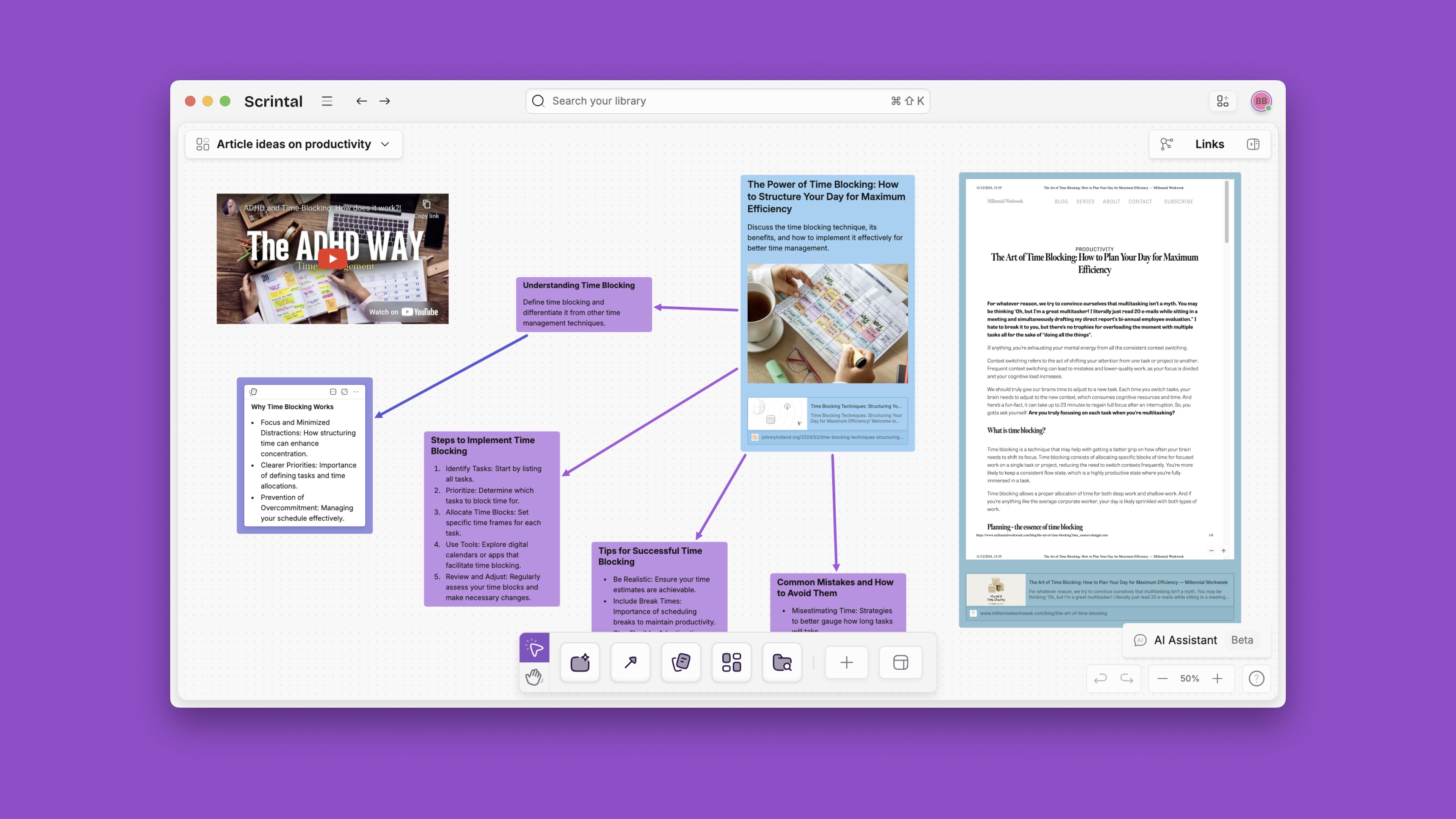
This is also true for backlinks, which in Scrintal take you to a new floating note alongside the previous one. These notes can also be dragged around the page as required, and can be worked on simultaneously.
Intuitive User Experience
Both Milanote and Scrintal contain useful (and different) features. Some may find Milanote’s column layout too restrictive, so Scrintal may be a good intuitive alternative: the platform is easily navigable with common shortcuts to avoid interrupting one’s train of thought and a small learning curve.
Both platforms use board and cards(docs in Scrintal), but Scrintal docs tend to be linked in a tree to indicate the network of connections between ideas. Milanote cards are organized differently, with each card existing only in a single column unless duplicated.
Side-by-side comparison and editing of notes in Scrintal means that the flow of ideas does not have to stop in order for the user to scroll and navigate to the proper note on the proper column to write down information. Especially with more complex boards, Scrintal may be easier to navigate with its flexible visual mind map.
Personal Knowledge Management
With a personal knowledge management system, users can collect and create information to organize for more effective future use. PKM sounds daunting because of the breadth and depth of potentially relevant information, but with Scrintal you can organize information as it appears and make connections between topics.
You can also customize the visual display of this information: make clusters, trees, or intricate maps as needed, or dismiss and display notes as needed without losing the connections.
In Milanote, the collection of knowledge is done in a similar way (with cards), while the display is in columns; you can also create this column-organization in Scrintal, with blocks.
Scrintal’s spatial canvas is a critically important feature for mind-mapping, but it is far more than flashcards on a corkboard: there is no word limit for any card, and you can also embed images, videos, tweets, and PDFs to expand the potential for connections and remain within the Scrintal ecosystem. Backlinks to other cards and boards make related information easily accessible.
Milanote has many similar features, except that its connection system is more visual in nature: arrows are used to indicate connections between cards, but only external sources can be properly linked. In Scrintal, you can link to a doc (whether or not it is present on the desk or a board) or an entire board, enabling ease of access during creative ideation.
Connected Note Taking
In Scrintal, you can create networked connections between notes and edit them simultaneously. The same is true of Milanote, but cards only exist on the board and do not open in a new tab to edit; therefore, a card with a long paragraph of text will require scrolling to view the whole column, whereas, in Scrintal, you can choose between Compact, Snippet, or Full view of docs on the board. So you can fold docs to view titles only for a holistic overview of the board.
Being able to recognize the connections between different ideas inspires further creativity, which makes these features critical. Scrintal and Milanote both use visual representations to display the connectedness between notes; but in Milanote, the connection is purely visual and not linked. Scrintal displays the entirety of a particular map of notes using boards that differentiate topics, and connections are linked, allowing the user to open them while reading for easy reference.


Multimedia Detailed Notes
Milanote emphasizes media files as part of your board, so just like in Scrintal, you can upload or embed images, videos, and document files like PDFs. In Scrintal, you can open these media files in a new “floating” tab and drag them around your board, allowing you to read, watch, or listen to them while note-taking.
In Milanote, you can open multimedia files, but they take over your screen; you can view images and watch embedded videos (like YouTube videos) within the card instead, but documents cannot be read while note-taking.

This is also true for backlinks, which in Scrintal take you to a new floating note alongside the previous one. These notes can also be dragged around the page as required, and can be worked on simultaneously.
Intuitive User Experience
Both Milanote and Scrintal contain useful (and different) features. Some may find Milanote’s column layout too restrictive, so Scrintal may be a good intuitive alternative: the platform is easily navigable with common shortcuts to avoid interrupting one’s train of thought and a small learning curve.
Both platforms use board and cards(docs in Scrintal), but Scrintal docs tend to be linked in a tree to indicate the network of connections between ideas. Milanote cards are organized differently, with each card existing only in a single column unless duplicated.
Side-by-side comparison and editing of notes in Scrintal means that the flow of ideas does not have to stop in order for the user to scroll and navigate to the proper note on the proper column to write down information. Especially with more complex boards, Scrintal may be easier to navigate with its flexible visual mind map.
Personal Knowledge Management
With a personal knowledge management system, users can collect and create information to organize for more effective future use. PKM sounds daunting because of the breadth and depth of potentially relevant information, but with Scrintal you can organize information as it appears and make connections between topics.
You can also customize the visual display of this information: make clusters, trees, or intricate maps as needed, or dismiss and display notes as needed without losing the connections.
In Milanote, the collection of knowledge is done in a similar way (with cards), while the display is in columns; you can also create this column-organization in Scrintal, with blocks.
Scrintal’s spatial canvas is a critically important feature for mind-mapping, but it is far more than flashcards on a corkboard: there is no word limit for any card, and you can also embed images, videos, tweets, and PDFs to expand the potential for connections and remain within the Scrintal ecosystem. Backlinks to other cards and boards make related information easily accessible.
Milanote has many similar features, except that its connection system is more visual in nature: arrows are used to indicate connections between cards, but only external sources can be properly linked. In Scrintal, you can link to a doc (whether or not it is present on the desk or a board) or an entire board, enabling ease of access during creative ideation.
Connected Note Taking
In Scrintal, you can create networked connections between notes and edit them simultaneously. The same is true of Milanote, but cards only exist on the board and do not open in a new tab to edit; therefore, a card with a long paragraph of text will require scrolling to view the whole column, whereas, in Scrintal, you can choose between Compact, Snippet, or Full view of docs on the board. So you can fold docs to view titles only for a holistic overview of the board.
Being able to recognize the connections between different ideas inspires further creativity, which makes these features critical. Scrintal and Milanote both use visual representations to display the connectedness between notes; but in Milanote, the connection is purely visual and not linked. Scrintal displays the entirety of a particular map of notes using boards that differentiate topics, and connections are linked, allowing the user to open them while reading for easy reference.


Multimedia Detailed Notes
Milanote emphasizes media files as part of your board, so just like in Scrintal, you can upload or embed images, videos, and document files like PDFs. In Scrintal, you can open these media files in a new “floating” tab and drag them around your board, allowing you to read, watch, or listen to them while note-taking.
In Milanote, you can open multimedia files, but they take over your screen; you can view images and watch embedded videos (like YouTube videos) within the card instead, but documents cannot be read while note-taking.

This is also true for backlinks, which in Scrintal take you to a new floating note alongside the previous one. These notes can also be dragged around the page as required, and can be worked on simultaneously.
Intuitive User Experience
Both Milanote and Scrintal contain useful (and different) features. Some may find Milanote’s column layout too restrictive, so Scrintal may be a good intuitive alternative: the platform is easily navigable with common shortcuts to avoid interrupting one’s train of thought and a small learning curve.
Both platforms use board and cards(docs in Scrintal), but Scrintal docs tend to be linked in a tree to indicate the network of connections between ideas. Milanote cards are organized differently, with each card existing only in a single column unless duplicated.
Side-by-side comparison and editing of notes in Scrintal means that the flow of ideas does not have to stop in order for the user to scroll and navigate to the proper note on the proper column to write down information. Especially with more complex boards, Scrintal may be easier to navigate with its flexible visual mind map.
Personal Knowledge Management
With a personal knowledge management system, users can collect and create information to organize for more effective future use. PKM sounds daunting because of the breadth and depth of potentially relevant information, but with Scrintal you can organize information as it appears and make connections between topics.
You can also customize the visual display of this information: make clusters, trees, or intricate maps as needed, or dismiss and display notes as needed without losing the connections.
In Milanote, the collection of knowledge is done in a similar way (with cards), while the display is in columns; you can also create this column-organization in Scrintal, with blocks.
Scrintal’s spatial canvas is a critically important feature for mind-mapping, but it is far more than flashcards on a corkboard: there is no word limit for any card, and you can also embed images, videos, tweets, and PDFs to expand the potential for connections and remain within the Scrintal ecosystem. Backlinks to other cards and boards make related information easily accessible.
Milanote has many similar features, except that its connection system is more visual in nature: arrows are used to indicate connections between cards, but only external sources can be properly linked. In Scrintal, you can link to a doc (whether or not it is present on the desk or a board) or an entire board, enabling ease of access during creative ideation.
Connected Note Taking
In Scrintal, you can create networked connections between notes and edit them simultaneously. The same is true of Milanote, but cards only exist on the board and do not open in a new tab to edit; therefore, a card with a long paragraph of text will require scrolling to view the whole column, whereas, in Scrintal, you can choose between Compact, Snippet, or Full view of docs on the board. So you can fold docs to view titles only for a holistic overview of the board.
Being able to recognize the connections between different ideas inspires further creativity, which makes these features critical. Scrintal and Milanote both use visual representations to display the connectedness between notes; but in Milanote, the connection is purely visual and not linked. Scrintal displays the entirety of a particular map of notes using boards that differentiate topics, and connections are linked, allowing the user to open them while reading for easy reference.


Multimedia Detailed Notes
Milanote emphasizes media files as part of your board, so just like in Scrintal, you can upload or embed images, videos, and document files like PDFs. In Scrintal, you can open these media files in a new “floating” tab and drag them around your board, allowing you to read, watch, or listen to them while note-taking.
In Milanote, you can open multimedia files, but they take over your screen; you can view images and watch embedded videos (like YouTube videos) within the card instead, but documents cannot be read while note-taking.

This is also true for backlinks, which in Scrintal take you to a new floating note alongside the previous one. These notes can also be dragged around the page as required, and can be worked on simultaneously.
Intuitive User Experience
Both Milanote and Scrintal contain useful (and different) features. Some may find Milanote’s column layout too restrictive, so Scrintal may be a good intuitive alternative: the platform is easily navigable with common shortcuts to avoid interrupting one’s train of thought and a small learning curve.
Both platforms use board and cards(docs in Scrintal), but Scrintal docs tend to be linked in a tree to indicate the network of connections between ideas. Milanote cards are organized differently, with each card existing only in a single column unless duplicated.
Side-by-side comparison and editing of notes in Scrintal means that the flow of ideas does not have to stop in order for the user to scroll and navigate to the proper note on the proper column to write down information. Especially with more complex boards, Scrintal may be easier to navigate with its flexible visual mind map.
Personal Knowledge Management
With a personal knowledge management system, users can collect and create information to organize for more effective future use. PKM sounds daunting because of the breadth and depth of potentially relevant information, but with Scrintal you can organize information as it appears and make connections between topics.
You can also customize the visual display of this information: make clusters, trees, or intricate maps as needed, or dismiss and display notes as needed without losing the connections.
In Milanote, the collection of knowledge is done in a similar way (with cards), while the display is in columns; you can also create this column-organization in Scrintal, with blocks.
Scrintal’s spatial canvas is a critically important feature for mind-mapping, but it is far more than flashcards on a corkboard: there is no word limit for any card, and you can also embed images, videos, tweets, and PDFs to expand the potential for connections and remain within the Scrintal ecosystem. Backlinks to other cards and boards make related information easily accessible.
Milanote has many similar features, except that its connection system is more visual in nature: arrows are used to indicate connections between cards, but only external sources can be properly linked. In Scrintal, you can link to a doc (whether or not it is present on the desk or a board) or an entire board, enabling ease of access during creative ideation.
Connected Note Taking
In Scrintal, you can create networked connections between notes and edit them simultaneously. The same is true of Milanote, but cards only exist on the board and do not open in a new tab to edit; therefore, a card with a long paragraph of text will require scrolling to view the whole column, whereas, in Scrintal, you can choose between Compact, Snippet, or Full view of docs on the board. So you can fold docs to view titles only for a holistic overview of the board.
Being able to recognize the connections between different ideas inspires further creativity, which makes these features critical. Scrintal and Milanote both use visual representations to display the connectedness between notes; but in Milanote, the connection is purely visual and not linked. Scrintal displays the entirety of a particular map of notes using boards that differentiate topics, and connections are linked, allowing the user to open them while reading for easy reference.


Multimedia Detailed Notes
Milanote emphasizes media files as part of your board, so just like in Scrintal, you can upload or embed images, videos, and document files like PDFs. In Scrintal, you can open these media files in a new “floating” tab and drag them around your board, allowing you to read, watch, or listen to them while note-taking.
In Milanote, you can open multimedia files, but they take over your screen; you can view images and watch embedded videos (like YouTube videos) within the card instead, but documents cannot be read while note-taking.

This is also true for backlinks, which in Scrintal take you to a new floating note alongside the previous one. These notes can also be dragged around the page as required, and can be worked on simultaneously.
Intuitive User Experience
Both Milanote and Scrintal contain useful (and different) features. Some may find Milanote’s column layout too restrictive, so Scrintal may be a good intuitive alternative: the platform is easily navigable with common shortcuts to avoid interrupting one’s train of thought and a small learning curve.
Both platforms use board and cards(docs in Scrintal), but Scrintal docs tend to be linked in a tree to indicate the network of connections between ideas. Milanote cards are organized differently, with each card existing only in a single column unless duplicated.
Side-by-side comparison and editing of notes in Scrintal means that the flow of ideas does not have to stop in order for the user to scroll and navigate to the proper note on the proper column to write down information. Especially with more complex boards, Scrintal may be easier to navigate with its flexible visual mind map.
Milanote Alternative: The Pros and Cons Comparison
Milanote Pros
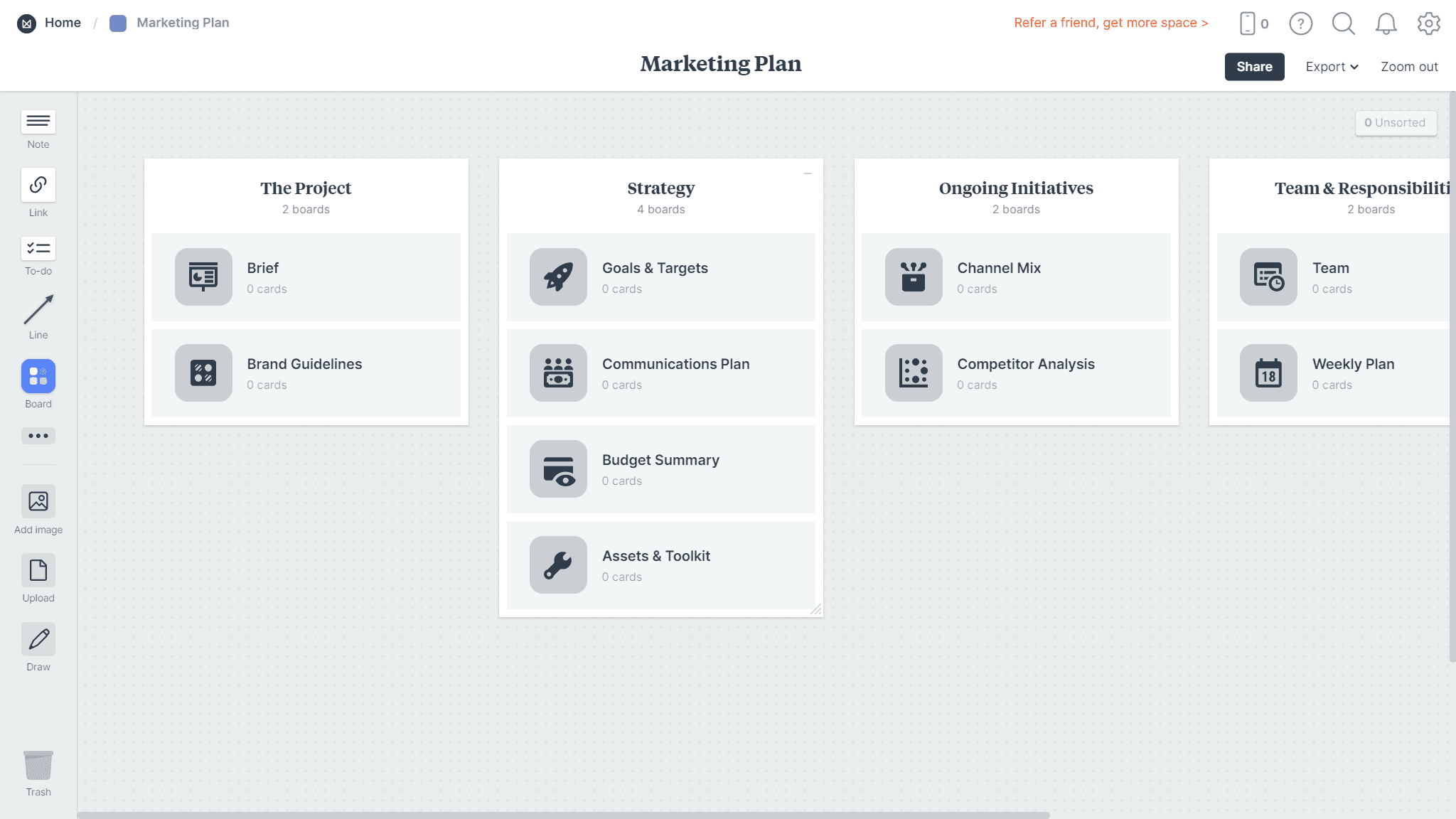
The Milanote interface is simple and attractive, with a dotted background and columns that can be moved around the board. It has a wide range of options for customizability, given its focus on the visual. Its templates, which tend to be image-focused and thus marketing-adjacent, provide a good starting point for organization of ideas and strategization. To put it simply, it has just enough features to make it functional and easy to use without being overloaded.
Cards can be moved between columns of a board the same way you can move a task on Trello: by dragging it over. Cards can consist of notes, images, links, to-do lists, documents, audio and video files (below a certain size threshold), and even maps and colour chips. You can add sketches or sketch on existing image files which is mainly useful for designers.
The platform does not appear to be catered to text-heavy projects, since cards with text cannot be individually collapsed while not in use; only whole columns can be collapsed (i.e. minimized). This makes it a great tool for visual learners or those using many visuals in their ideation process. You can also collaborate in real time with other Milanote users, which makes it good for teams.
Scrintal Pros
The structure and flow of Scrintal lends itself to an intuitive process from beginning to end: plan, brainstorm, execute, and share. This method of work makes the journey from ideation to presentation smooth and prevents interruptions to the creative thought process due to formatting, organization, or tab switching.
Empowering your first brain
Scrintal’s virtual canvas ensures the steady flow of creativity without interruptions. Connections rise to the surface more easily in a visual format and are not at risk of being forgotten or overlooked. The Scrintal ecosystem can host videos and PDFs on the same screen as an editable note, avoiding the need to scroll up and down or switch back and forth between tabs or windows. Your research and writing can take place in the same environment.
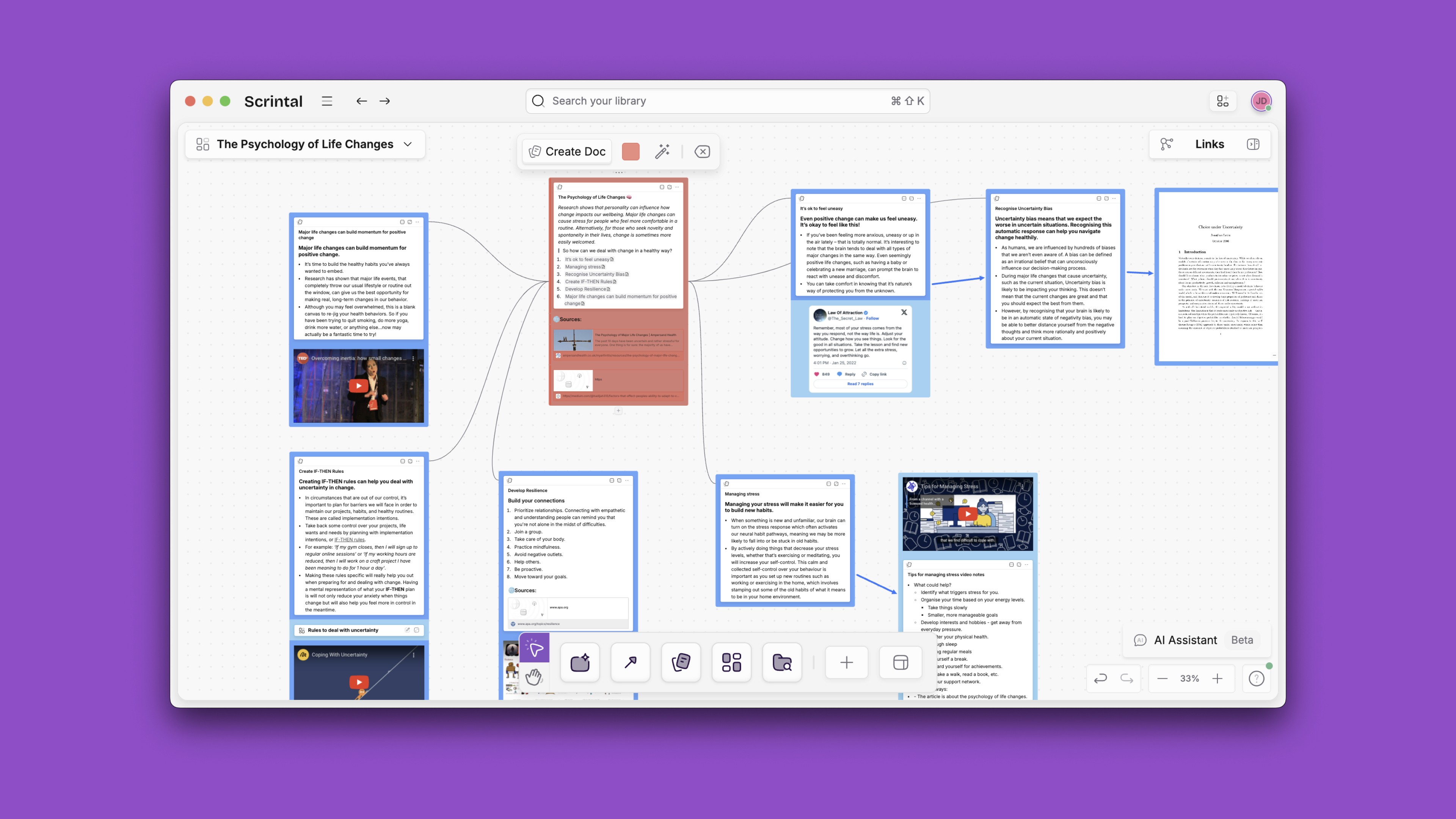
As needed, notes can appear as blocks, docs, full-screen text editors (for focusing), or titles only (for a holistic view of the network). This is a tool for the mind to more effectively engage with information and produce new ideas, as well as determine whether any information is missing or lacking.
Networked note taking
Docs can be linked together or tagged, and these are two of Scrintal’s most important features. Our minds work similarly, forming connections between ideas and using these connections to create a knowledge base that not only consists of information, but also a network that inspires innovation and enables problem-solving.
Creating a visual representation of this network, whether hierarchical or more flexible, is more efficient than holding it in your mind, where only one connection can be considered at a time and new ideas may be lost or forgotten.
In Milanote, arrows can be used on individual board to visually indicate connections, but there is no backlinking feature and connections are limited to the cards that exist on a single board (meaning you must have a card on the board to show a connection, even if it is not immediately relevant, and you also cannot move any card to a new column without also having to adjust the arrow).
In Scrintal, you can use boards to keep placements of docs consistent and ensure mind maps are organized in whichever way makes sense to you. If you move a doc, the arrow (and link) moves with it; if you dismiss a doc from your board, the link still exists in the vault. So you establish a more permanent connection rather than a temporary one. If you prefer a temporary connection, you can also create one with the connectors tool.
Milanote Cons
In Milanote, connections are not represented the way they are in Scrintal; while visual arrows between notes exist, there are no actual links connecting cards, making it difficult to interact with or change your board if you must also adjust the arrows on your screen. The platform does not prioritize connections between disparate cards, which may not make it the right tool for people who want to build a long-term knowledge base.
Editing cards while viewing media files is more limited in Milanote, since visuals rather than text are the focus of the platform. There are no floating tabs, like in Scrintal, allowing you to navigate all over your board while continuing to watch a video, for example.
It is also more difficult to have a holistic view of a board, since only columns can be collapsed, and not individual cards. Milanote has a maximum uploaded file size of just over fifty megabytes, which can be somewhat limiting. And there is no offline mode or mobile app to edit on the go (though both are in progress), which can be a dealbreaker for some working professionals.
Scrintal Cons
Scrintal is an early stage product and its team implements community feedback in product updates. It is younger and less tested than Milanote, meaning it has more areas for improvement.
For example, the ability to annotate PDFs is a hugely important feature for research and note-taking purposes, and this functionality is not yet available in Scrintal (or Milanote). You can collaborate on Scrintal docs and boards, but Milanote has more advanced publishing and collaboration features that allow other platform users to comment, or notify team members in the app.
Integrations with a wide range of other apps like calendars, meeting platforms, and task management software are still being developed for Scrintal. A mobile app are in the works in order to provide a competitive and uninterrupted experience.
For now, some users, especially designers, may find they are best served using either Milanote for projects that require a lot of visualization. But when they need to plan their work or build a long-term knowledge base, Scrintal could become a better choice.
Milanote Pros
The Milanote interface is simple and attractive, with a dotted background and columns that can be moved around the board. It has a wide range of options for customizability, given its focus on the visual. Its templates, which tend to be image-focused and thus marketing-adjacent, provide a good starting point for organization of ideas and strategization. To put it simply, it has just enough features to make it functional and easy to use without being overloaded.
Cards can be moved between columns of a board the same way you can move a task on Trello: by dragging it over. Cards can consist of notes, images, links, to-do lists, documents, audio and video files (below a certain size threshold), and even maps and colour chips. You can add sketches or sketch on existing image files which is mainly useful for designers.
The platform does not appear to be catered to text-heavy projects, since cards with text cannot be individually collapsed while not in use; only whole columns can be collapsed (i.e. minimized). This makes it a great tool for visual learners or those using many visuals in their ideation process. You can also collaborate in real time with other Milanote users, which makes it good for teams.

Scrintal Pros
The structure and flow of Scrintal lends itself to an intuitive process from beginning to end: plan, brainstorm, execute, and share. This method of work makes the journey from ideation to presentation smooth and prevents interruptions to the creative thought process due to formatting, organization, or tab switching.
Empowering your first brain
Scrintal’s virtual canvas ensures the steady flow of creativity without interruptions. Connections rise to the surface more easily in a visual format and are not at risk of being forgotten or overlooked. The Scrintal ecosystem can host videos and PDFs on the same screen as an editable note, avoiding the need to scroll up and down or switch back and forth between tabs or windows. Your research and writing can take place in the same environment.

As needed, notes can appear as blocks, docs, full-screen text editors (for focusing), or titles only (for a holistic view of the network). This is a tool for the mind to more effectively engage with information and produce new ideas, as well as determine whether any information is missing or lacking.
Networked note taking
Docs can be linked together or tagged, and these are two of Scrintal’s most important features. Our minds work similarly, forming connections between ideas and using these connections to create a knowledge base that not only consists of information, but also a network that inspires innovation and enables problem-solving.
Creating a visual representation of this network, whether hierarchical or more flexible, is more efficient than holding it in your mind, where only one connection can be considered at a time and new ideas may be lost or forgotten.
In Milanote, arrows can be used on individual board to visually indicate connections, but there is no backlinking feature and connections are limited to the cards that exist on a single board (meaning you must have a card on the board to show a connection, even if it is not immediately relevant, and you also cannot move any card to a new column without also having to adjust the arrow).
In Scrintal, you can use boards to keep placements of docs consistent and ensure mind maps are organized in whichever way makes sense to you. If you move a doc, the arrow (and link) moves with it; if you dismiss a doc from your board, the link still exists in the vault. So you establish a more permanent connection rather than a temporary one. If you prefer a temporary connection, you can also create one with the connectors tool.
Milanote Cons
In Milanote, connections are not represented the way they are in Scrintal; while visual arrows between notes exist, there are no actual links connecting cards, making it difficult to interact with or change your board if you must also adjust the arrows on your screen. The platform does not prioritize connections between disparate cards, which may not make it the right tool for people who want to build a long-term knowledge base.
Editing cards while viewing media files is more limited in Milanote, since visuals rather than text are the focus of the platform. There are no floating tabs, like in Scrintal, allowing you to navigate all over your board while continuing to watch a video, for example.
It is also more difficult to have a holistic view of a board, since only columns can be collapsed, and not individual cards. Milanote has a maximum uploaded file size of just over fifty megabytes, which can be somewhat limiting. And there is no offline mode or mobile app to edit on the go (though both are in progress), which can be a dealbreaker for some working professionals.
Scrintal Cons
Scrintal is an early stage product and its team implements community feedback in product updates. It is younger and less tested than Milanote, meaning it has more areas for improvement.
For example, the ability to annotate PDFs is a hugely important feature for research and note-taking purposes, and this functionality is not yet available in Scrintal (or Milanote). You can collaborate on Scrintal docs and boards, but Milanote has more advanced publishing and collaboration features that allow other platform users to comment, or notify team members in the app.
Integrations with a wide range of other apps like calendars, meeting platforms, and task management software are still being developed for Scrintal. A mobile app are in the works in order to provide a competitive and uninterrupted experience.
For now, some users, especially designers, may find they are best served using either Milanote for projects that require a lot of visualization. But when they need to plan their work or build a long-term knowledge base, Scrintal could become a better choice.
Milanote Pros
The Milanote interface is simple and attractive, with a dotted background and columns that can be moved around the board. It has a wide range of options for customizability, given its focus on the visual. Its templates, which tend to be image-focused and thus marketing-adjacent, provide a good starting point for organization of ideas and strategization. To put it simply, it has just enough features to make it functional and easy to use without being overloaded.
Cards can be moved between columns of a board the same way you can move a task on Trello: by dragging it over. Cards can consist of notes, images, links, to-do lists, documents, audio and video files (below a certain size threshold), and even maps and colour chips. You can add sketches or sketch on existing image files which is mainly useful for designers.
The platform does not appear to be catered to text-heavy projects, since cards with text cannot be individually collapsed while not in use; only whole columns can be collapsed (i.e. minimized). This makes it a great tool for visual learners or those using many visuals in their ideation process. You can also collaborate in real time with other Milanote users, which makes it good for teams.

Scrintal Pros
The structure and flow of Scrintal lends itself to an intuitive process from beginning to end: plan, brainstorm, execute, and share. This method of work makes the journey from ideation to presentation smooth and prevents interruptions to the creative thought process due to formatting, organization, or tab switching.
Empowering your first brain
Scrintal’s virtual canvas ensures the steady flow of creativity without interruptions. Connections rise to the surface more easily in a visual format and are not at risk of being forgotten or overlooked. The Scrintal ecosystem can host videos and PDFs on the same screen as an editable note, avoiding the need to scroll up and down or switch back and forth between tabs or windows. Your research and writing can take place in the same environment.

As needed, notes can appear as blocks, docs, full-screen text editors (for focusing), or titles only (for a holistic view of the network). This is a tool for the mind to more effectively engage with information and produce new ideas, as well as determine whether any information is missing or lacking.
Networked note taking
Docs can be linked together or tagged, and these are two of Scrintal’s most important features. Our minds work similarly, forming connections between ideas and using these connections to create a knowledge base that not only consists of information, but also a network that inspires innovation and enables problem-solving.
Creating a visual representation of this network, whether hierarchical or more flexible, is more efficient than holding it in your mind, where only one connection can be considered at a time and new ideas may be lost or forgotten.
In Milanote, arrows can be used on individual board to visually indicate connections, but there is no backlinking feature and connections are limited to the cards that exist on a single board (meaning you must have a card on the board to show a connection, even if it is not immediately relevant, and you also cannot move any card to a new column without also having to adjust the arrow).
In Scrintal, you can use boards to keep placements of docs consistent and ensure mind maps are organized in whichever way makes sense to you. If you move a doc, the arrow (and link) moves with it; if you dismiss a doc from your board, the link still exists in the vault. So you establish a more permanent connection rather than a temporary one. If you prefer a temporary connection, you can also create one with the connectors tool.
Milanote Cons
In Milanote, connections are not represented the way they are in Scrintal; while visual arrows between notes exist, there are no actual links connecting cards, making it difficult to interact with or change your board if you must also adjust the arrows on your screen. The platform does not prioritize connections between disparate cards, which may not make it the right tool for people who want to build a long-term knowledge base.
Editing cards while viewing media files is more limited in Milanote, since visuals rather than text are the focus of the platform. There are no floating tabs, like in Scrintal, allowing you to navigate all over your board while continuing to watch a video, for example.
It is also more difficult to have a holistic view of a board, since only columns can be collapsed, and not individual cards. Milanote has a maximum uploaded file size of just over fifty megabytes, which can be somewhat limiting. And there is no offline mode or mobile app to edit on the go (though both are in progress), which can be a dealbreaker for some working professionals.
Scrintal Cons
Scrintal is an early stage product and its team implements community feedback in product updates. It is younger and less tested than Milanote, meaning it has more areas for improvement.
For example, the ability to annotate PDFs is a hugely important feature for research and note-taking purposes, and this functionality is not yet available in Scrintal (or Milanote). You can collaborate on Scrintal docs and boards, but Milanote has more advanced publishing and collaboration features that allow other platform users to comment, or notify team members in the app.
Integrations with a wide range of other apps like calendars, meeting platforms, and task management software are still being developed for Scrintal. A mobile app are in the works in order to provide a competitive and uninterrupted experience.
For now, some users, especially designers, may find they are best served using either Milanote for projects that require a lot of visualization. But when they need to plan their work or build a long-term knowledge base, Scrintal could become a better choice.
Milanote Pros
The Milanote interface is simple and attractive, with a dotted background and columns that can be moved around the board. It has a wide range of options for customizability, given its focus on the visual. Its templates, which tend to be image-focused and thus marketing-adjacent, provide a good starting point for organization of ideas and strategization. To put it simply, it has just enough features to make it functional and easy to use without being overloaded.
Cards can be moved between columns of a board the same way you can move a task on Trello: by dragging it over. Cards can consist of notes, images, links, to-do lists, documents, audio and video files (below a certain size threshold), and even maps and colour chips. You can add sketches or sketch on existing image files which is mainly useful for designers.
The platform does not appear to be catered to text-heavy projects, since cards with text cannot be individually collapsed while not in use; only whole columns can be collapsed (i.e. minimized). This makes it a great tool for visual learners or those using many visuals in their ideation process. You can also collaborate in real time with other Milanote users, which makes it good for teams.

Scrintal Pros
The structure and flow of Scrintal lends itself to an intuitive process from beginning to end: plan, brainstorm, execute, and share. This method of work makes the journey from ideation to presentation smooth and prevents interruptions to the creative thought process due to formatting, organization, or tab switching.
Empowering your first brain
Scrintal’s virtual canvas ensures the steady flow of creativity without interruptions. Connections rise to the surface more easily in a visual format and are not at risk of being forgotten or overlooked. The Scrintal ecosystem can host videos and PDFs on the same screen as an editable note, avoiding the need to scroll up and down or switch back and forth between tabs or windows. Your research and writing can take place in the same environment.

As needed, notes can appear as blocks, docs, full-screen text editors (for focusing), or titles only (for a holistic view of the network). This is a tool for the mind to more effectively engage with information and produce new ideas, as well as determine whether any information is missing or lacking.
Networked note taking
Docs can be linked together or tagged, and these are two of Scrintal’s most important features. Our minds work similarly, forming connections between ideas and using these connections to create a knowledge base that not only consists of information, but also a network that inspires innovation and enables problem-solving.
Creating a visual representation of this network, whether hierarchical or more flexible, is more efficient than holding it in your mind, where only one connection can be considered at a time and new ideas may be lost or forgotten.
In Milanote, arrows can be used on individual board to visually indicate connections, but there is no backlinking feature and connections are limited to the cards that exist on a single board (meaning you must have a card on the board to show a connection, even if it is not immediately relevant, and you also cannot move any card to a new column without also having to adjust the arrow).
In Scrintal, you can use boards to keep placements of docs consistent and ensure mind maps are organized in whichever way makes sense to you. If you move a doc, the arrow (and link) moves with it; if you dismiss a doc from your board, the link still exists in the vault. So you establish a more permanent connection rather than a temporary one. If you prefer a temporary connection, you can also create one with the connectors tool.
Milanote Cons
In Milanote, connections are not represented the way they are in Scrintal; while visual arrows between notes exist, there are no actual links connecting cards, making it difficult to interact with or change your board if you must also adjust the arrows on your screen. The platform does not prioritize connections between disparate cards, which may not make it the right tool for people who want to build a long-term knowledge base.
Editing cards while viewing media files is more limited in Milanote, since visuals rather than text are the focus of the platform. There are no floating tabs, like in Scrintal, allowing you to navigate all over your board while continuing to watch a video, for example.
It is also more difficult to have a holistic view of a board, since only columns can be collapsed, and not individual cards. Milanote has a maximum uploaded file size of just over fifty megabytes, which can be somewhat limiting. And there is no offline mode or mobile app to edit on the go (though both are in progress), which can be a dealbreaker for some working professionals.
Scrintal Cons
Scrintal is an early stage product and its team implements community feedback in product updates. It is younger and less tested than Milanote, meaning it has more areas for improvement.
For example, the ability to annotate PDFs is a hugely important feature for research and note-taking purposes, and this functionality is not yet available in Scrintal (or Milanote). You can collaborate on Scrintal docs and boards, but Milanote has more advanced publishing and collaboration features that allow other platform users to comment, or notify team members in the app.
Integrations with a wide range of other apps like calendars, meeting platforms, and task management software are still being developed for Scrintal. A mobile app are in the works in order to provide a competitive and uninterrupted experience.
For now, some users, especially designers, may find they are best served using either Milanote for projects that require a lot of visualization. But when they need to plan their work or build a long-term knowledge base, Scrintal could become a better choice.
Milanote Pros
The Milanote interface is simple and attractive, with a dotted background and columns that can be moved around the board. It has a wide range of options for customizability, given its focus on the visual. Its templates, which tend to be image-focused and thus marketing-adjacent, provide a good starting point for organization of ideas and strategization. To put it simply, it has just enough features to make it functional and easy to use without being overloaded.
Cards can be moved between columns of a board the same way you can move a task on Trello: by dragging it over. Cards can consist of notes, images, links, to-do lists, documents, audio and video files (below a certain size threshold), and even maps and colour chips. You can add sketches or sketch on existing image files which is mainly useful for designers.
The platform does not appear to be catered to text-heavy projects, since cards with text cannot be individually collapsed while not in use; only whole columns can be collapsed (i.e. minimized). This makes it a great tool for visual learners or those using many visuals in their ideation process. You can also collaborate in real time with other Milanote users, which makes it good for teams.

Scrintal Pros
The structure and flow of Scrintal lends itself to an intuitive process from beginning to end: plan, brainstorm, execute, and share. This method of work makes the journey from ideation to presentation smooth and prevents interruptions to the creative thought process due to formatting, organization, or tab switching.
Empowering your first brain
Scrintal’s virtual canvas ensures the steady flow of creativity without interruptions. Connections rise to the surface more easily in a visual format and are not at risk of being forgotten or overlooked. The Scrintal ecosystem can host videos and PDFs on the same screen as an editable note, avoiding the need to scroll up and down or switch back and forth between tabs or windows. Your research and writing can take place in the same environment.

As needed, notes can appear as blocks, docs, full-screen text editors (for focusing), or titles only (for a holistic view of the network). This is a tool for the mind to more effectively engage with information and produce new ideas, as well as determine whether any information is missing or lacking.
Networked note taking
Docs can be linked together or tagged, and these are two of Scrintal’s most important features. Our minds work similarly, forming connections between ideas and using these connections to create a knowledge base that not only consists of information, but also a network that inspires innovation and enables problem-solving.
Creating a visual representation of this network, whether hierarchical or more flexible, is more efficient than holding it in your mind, where only one connection can be considered at a time and new ideas may be lost or forgotten.
In Milanote, arrows can be used on individual board to visually indicate connections, but there is no backlinking feature and connections are limited to the cards that exist on a single board (meaning you must have a card on the board to show a connection, even if it is not immediately relevant, and you also cannot move any card to a new column without also having to adjust the arrow).
In Scrintal, you can use boards to keep placements of docs consistent and ensure mind maps are organized in whichever way makes sense to you. If you move a doc, the arrow (and link) moves with it; if you dismiss a doc from your board, the link still exists in the vault. So you establish a more permanent connection rather than a temporary one. If you prefer a temporary connection, you can also create one with the connectors tool.
Milanote Cons
In Milanote, connections are not represented the way they are in Scrintal; while visual arrows between notes exist, there are no actual links connecting cards, making it difficult to interact with or change your board if you must also adjust the arrows on your screen. The platform does not prioritize connections between disparate cards, which may not make it the right tool for people who want to build a long-term knowledge base.
Editing cards while viewing media files is more limited in Milanote, since visuals rather than text are the focus of the platform. There are no floating tabs, like in Scrintal, allowing you to navigate all over your board while continuing to watch a video, for example.
It is also more difficult to have a holistic view of a board, since only columns can be collapsed, and not individual cards. Milanote has a maximum uploaded file size of just over fifty megabytes, which can be somewhat limiting. And there is no offline mode or mobile app to edit on the go (though both are in progress), which can be a dealbreaker for some working professionals.
Scrintal Cons
Scrintal is an early stage product and its team implements community feedback in product updates. It is younger and less tested than Milanote, meaning it has more areas for improvement.
For example, the ability to annotate PDFs is a hugely important feature for research and note-taking purposes, and this functionality is not yet available in Scrintal (or Milanote). You can collaborate on Scrintal docs and boards, but Milanote has more advanced publishing and collaboration features that allow other platform users to comment, or notify team members in the app.
Integrations with a wide range of other apps like calendars, meeting platforms, and task management software are still being developed for Scrintal. A mobile app are in the works in order to provide a competitive and uninterrupted experience.
For now, some users, especially designers, may find they are best served using either Milanote for projects that require a lot of visualization. But when they need to plan their work or build a long-term knowledge base, Scrintal could become a better choice.
Milanote Alternative Use Cases
Consultant
Consulting projects are almost always unique, composed of a specific set of deliverables to meet the needs of each client. It involves collecting loads of information, most of which will end up being irrelevant. For a client to execute recommendations requires careful planning and thorough explaining on the part of the consultant.
Scrintal has exactly the kind of features to enable and improve this process. Parsing through information to find the significant data points is made easier with a hierarchical structure. A visual network of connections that was created during the long research phase is valuable in explaining the reasons for recommendations, and the linking and tagging system makes it simple for a client to navigate between different facets of a recommendation.
The ability to share a board is the perfect medium: a simpler and more easily navigated version of a Prezi presentation that explains one’s thought process and inspires creativity to ensure no points are missed. In most cases, consulting is not heavier on visuals than most other professional fields, so Milanote might not be the best choice because text-heavy notes, especially without a link feature, will make a board harder to navigate.
Knowledge Worker
Scrintal is useful for organizing knowledge work like writing journalistic articles, scholastic papers in the arts and sciences, and reports for corporate use. Ideating and planning is made easy with the hierarchical and flexible structuring that the platform offers, and the abilities to fold, unfold, display, and dismiss cards as needed enables holistic awareness and focused work. Again, this type of work is not heavy on visuals, making Scrintal a more intuitive choice than Milanote.
For example, a journalist can use Scrintal to record the different facets of a story, including interview notes and critical images, documents, and videos, see how they connect, and have a bird’s-eye view of how an article can come together. With Milanote, this bird’s-eye view would not be easy, and it would be difficult to organize text-heavy content like interview notes and fact-finding investigations.
Also, scientists can plan their papers within Scrintal, utilizing the whole ecosystem to keep their sources, notes, data, and original ideas together in a single place; Milanote may be another option for this if there are lots of graphs, but Scrintal has very similar functionalities with the added bonus of being able to handle lots of text.
In a corporate setting, the platform can be used to construct business reports from the ground up by consolidating information; connections may reveal new areas of exploration and new data to collect.
There are, however, ways to utilize both Scrintal and Milanote in creating a report (even if it has nothing to do with marketing). For example, many reports do have a large visual component that can be added after the content is completed; in this case, Milanote can act as an organization tool for images with the only necessary text being subheadings or image captions.
Student/Researcher
Visual representations of a network of knowledge are particularly important to students and researchers because in order to study material effectively or write a convincing essay or thesis, information must be organized, holistic, relevant, and cited. Within Scrintal, one could store notes on lectures or research papers, a list of sources as a bibliography, ideas for an essay topic, or a table of contents outlining a scholarly article.
The hierarchical structure of a network on the platform can help cultivate a thesis; this feature is not present in Milanote, because it organizes information in columns that are cumbersome to move around the board because they mess with the visual cohesiveness of the Milanote board.
An important future feature for both platforms would be the ability to annotate documents like scholarly papers; in Scrintal, you can read PDFs while note-taking, while in Milanote, you can only read or write notes at any one time.
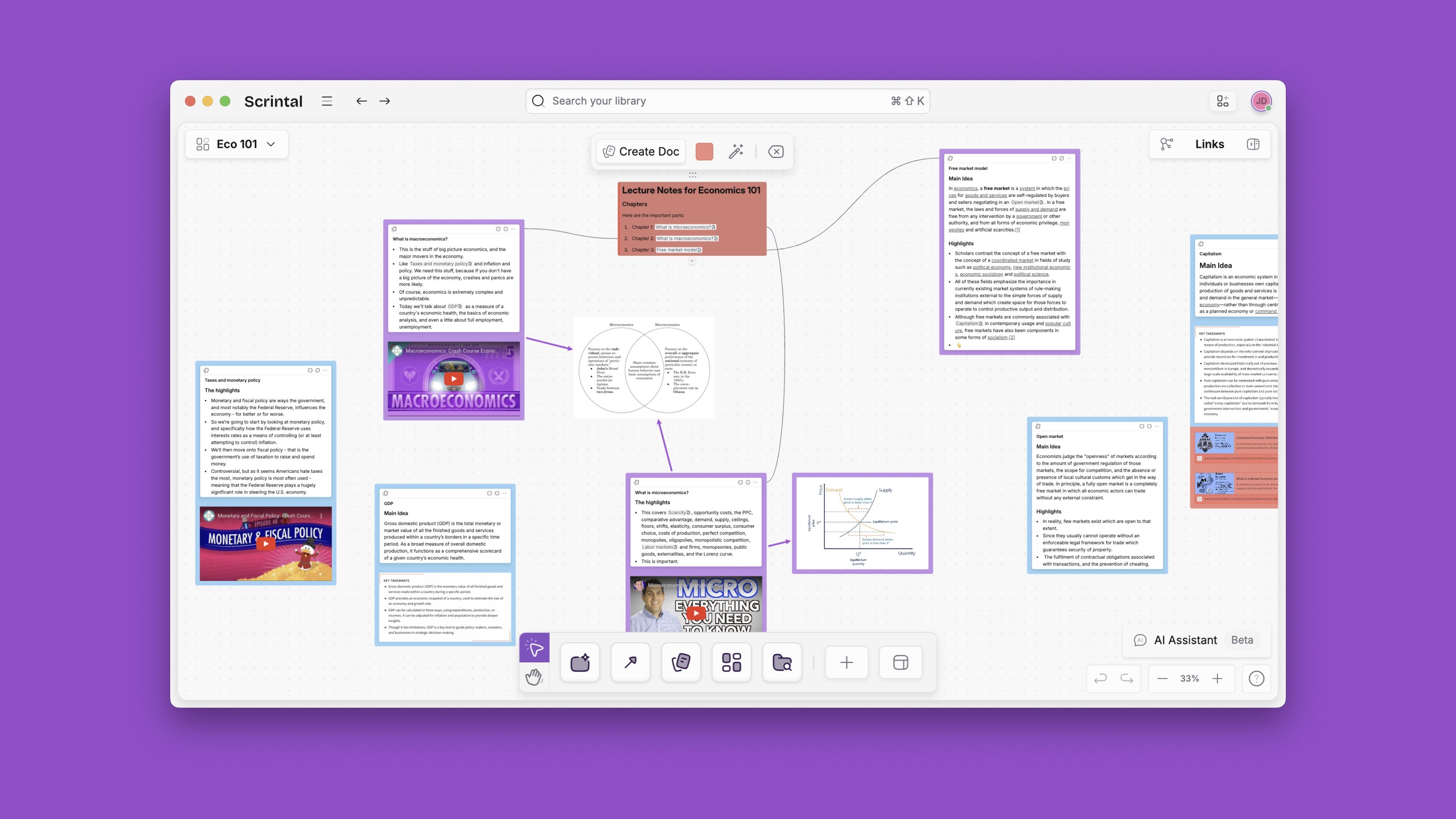


Isha Trivedi
Unlock brilliance
Company
Guides
Comparisons
Unlock brilliance
Company
Guides
Comparisons
Unlock brilliance
Company
Guides
Comparisons