


Visual note-taking tools are a great alternative to platforms that resemble a traditional notebook. The ability to incorporate images, videos, PDFs, and a customizable and changeable structure can enhance our ideation process and more efficiently preserve the connections between different ideas. Without it, creative thinking is hindered and some ideas lose their potential without context.
Scrintal is a visual note-taking tool that focuses on mind-mapping: the user creates blocks and docs that can contain multimedia files, tags to increase accessibility, and links to other docs that display as lines between them. A map of docs exists on a board, and any doc can exist on more than one board as needed. We’ve already compared Scrintal to a myriad of other popular note-taking tools, and today we’ll contrast Scrintal’s features with those of other visual tools.
This guide should help you decide which tool (or combination of tools) will serve your note-taking needs. The good news is, there is a large set of options to choose from!
Features of Visual Note-taking Toolsn
Some of the popular visual tools you may have heard of (or even tested) are:
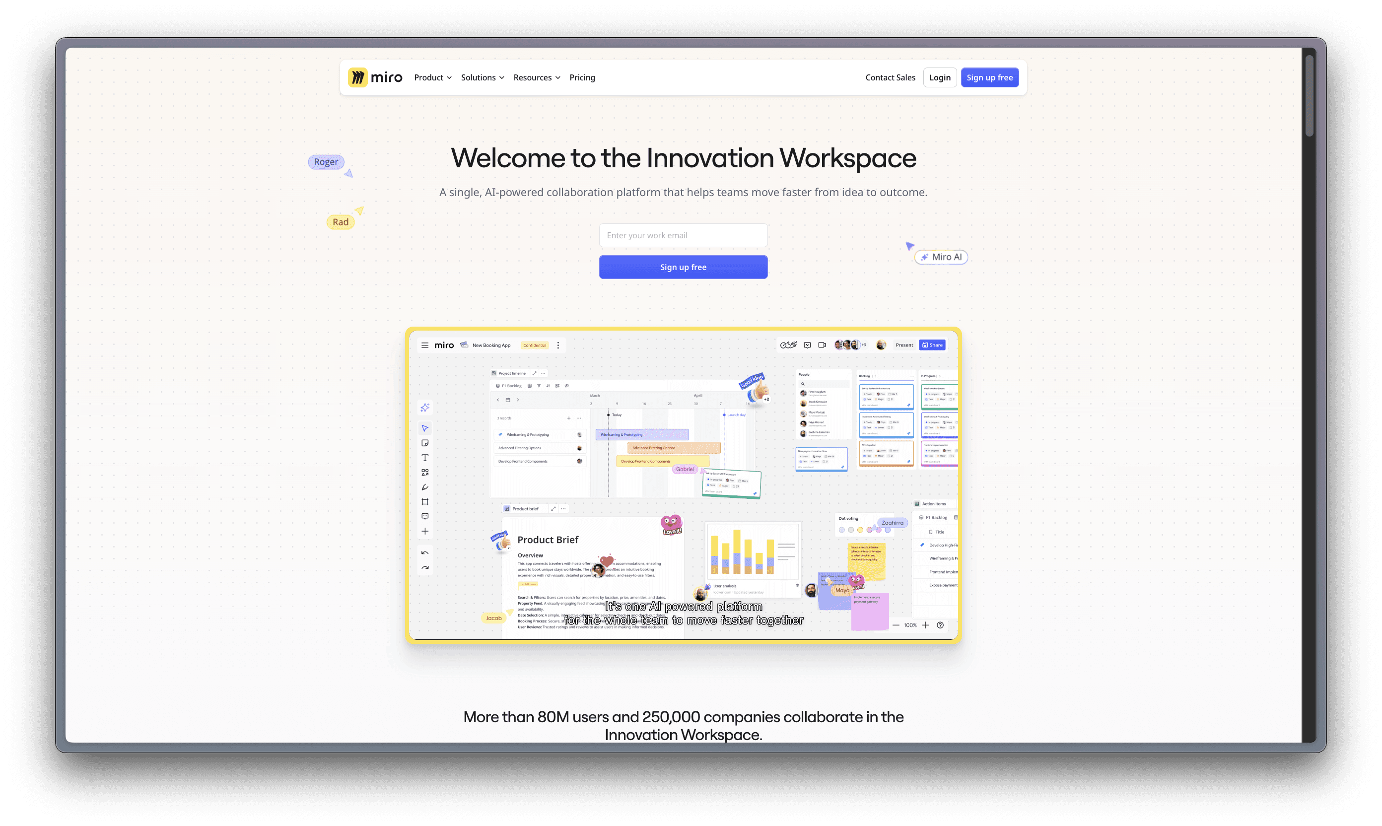
Miro
A visual workspace for innovation that enables distributed teams of any size to dream, design, and build the future together.
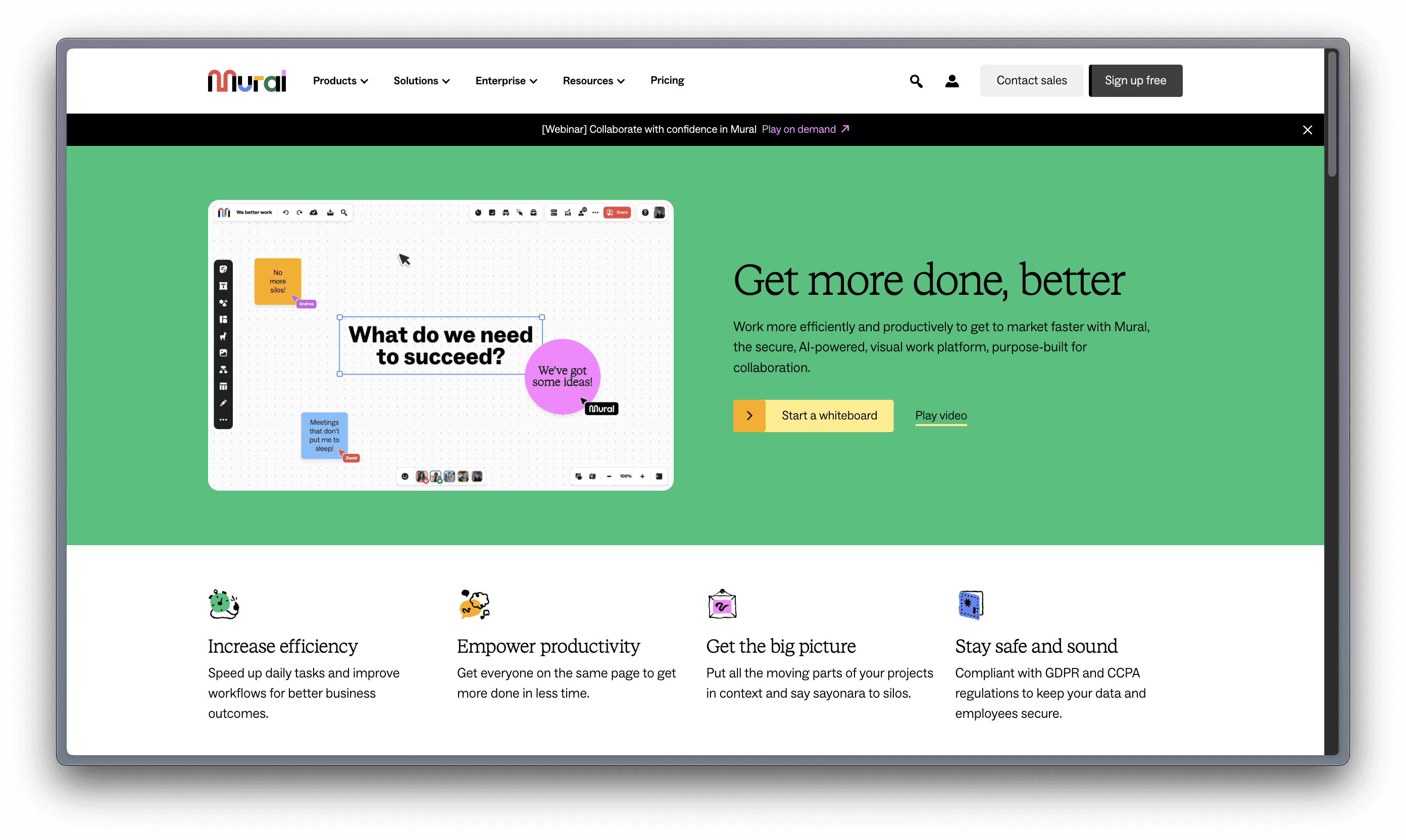
Mural
More than just a whiteboard, Mural can be used to make every workflow more organized, fruitful, and productive.
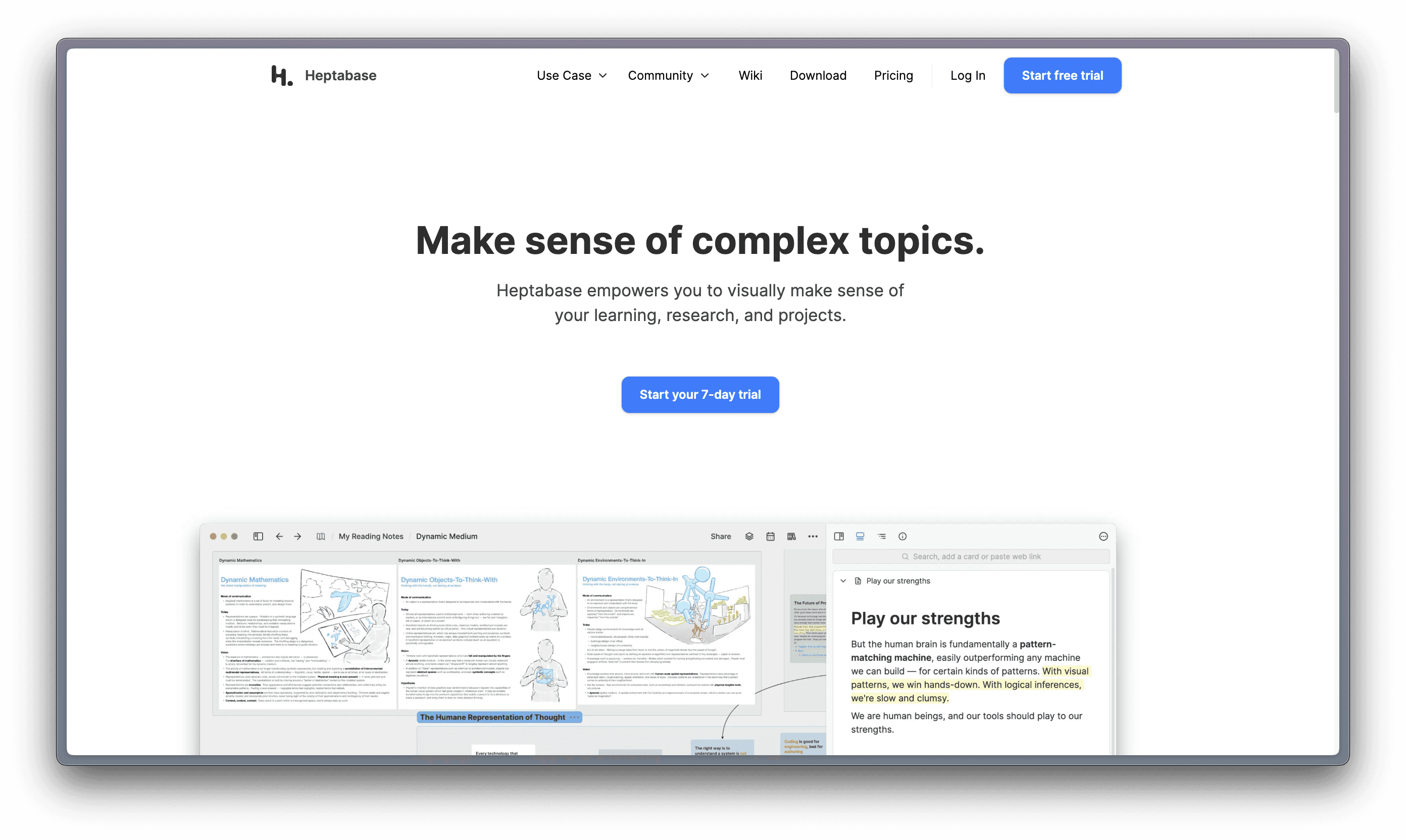
Heptabase – requires a paid subscription
A note-taking tool for visual learning. Make sense of complex topics.
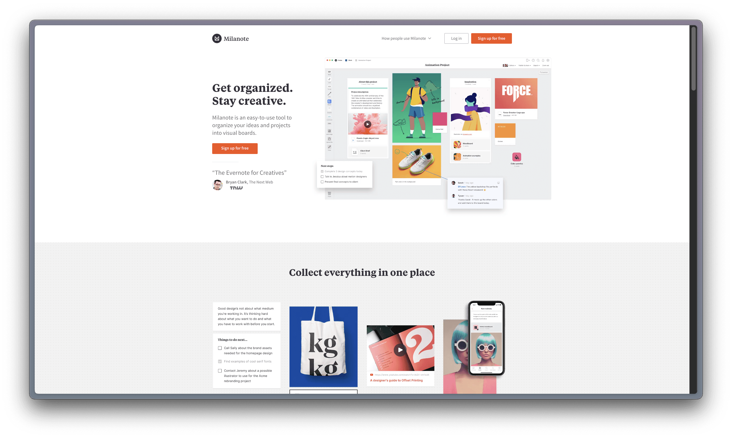
Milanote
Get organized. Stay creative. Milanote is an easy-to-use tool to organize your ideas and projects into visual boards.
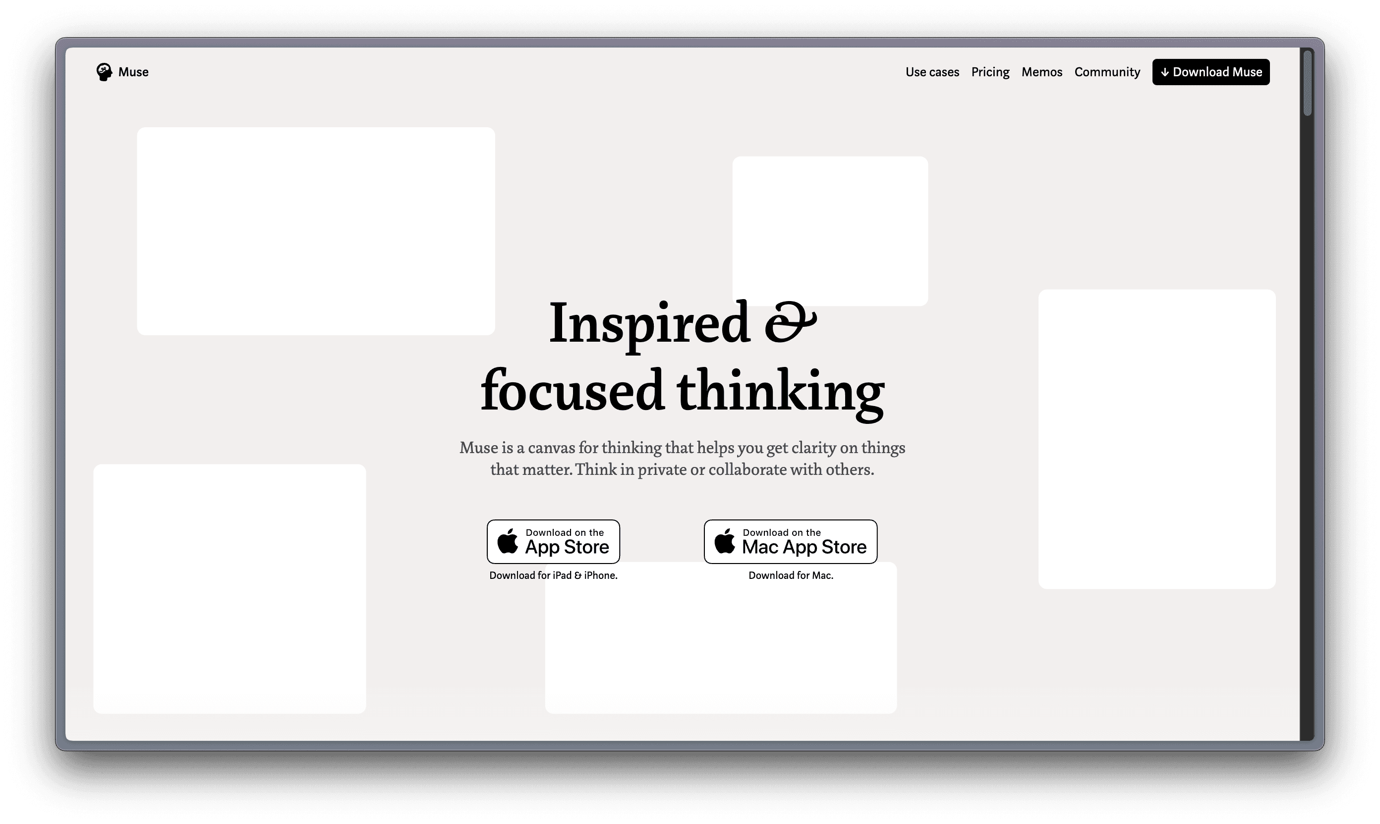
Muse – only available for Apple products
Muse is a canvas for thinking that helps you get clarity on things that matter. Your tool for deep work on iPad and Mac.
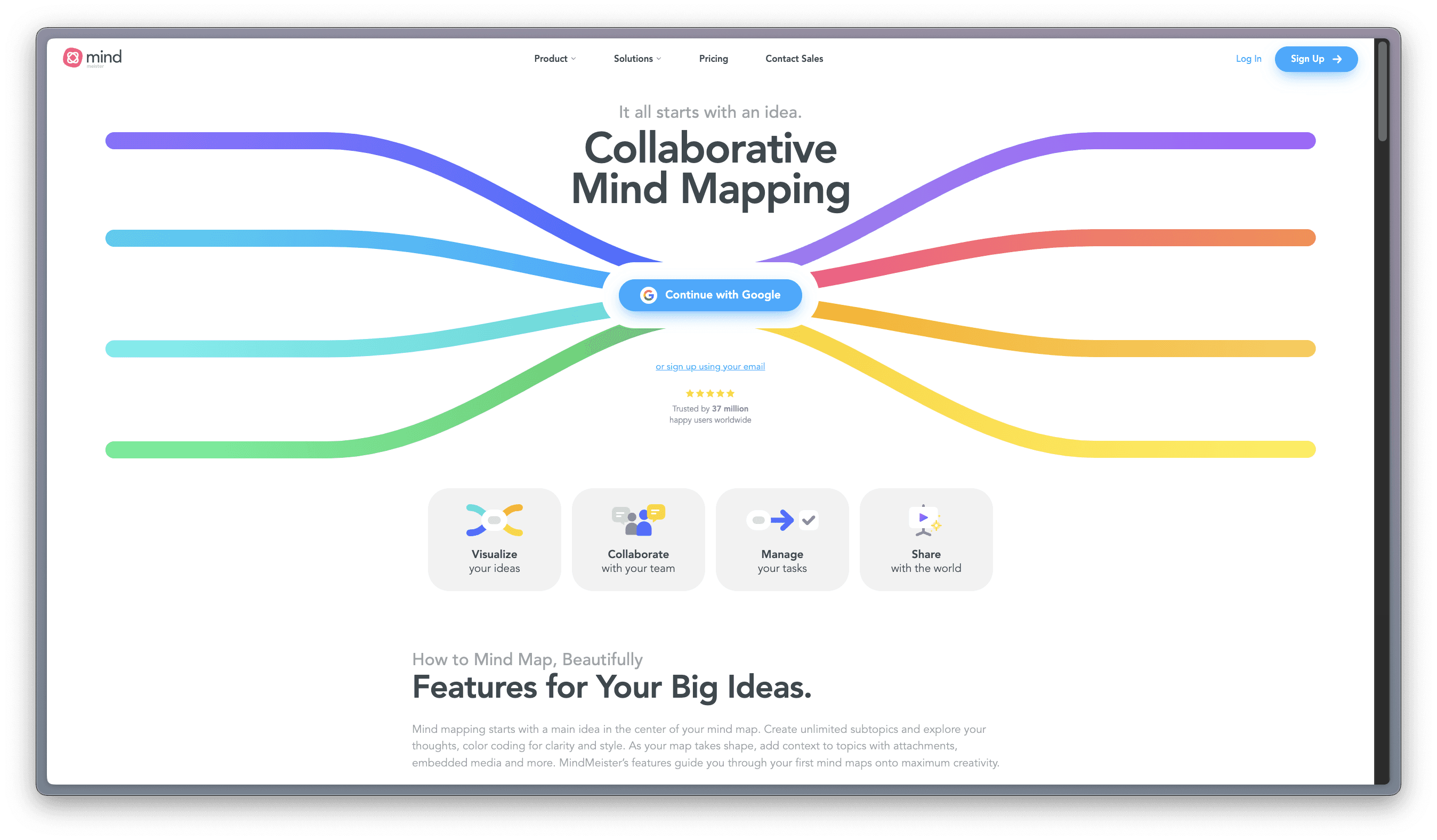
Mindmeister
Collaborative Mind Mapping: It All Starts with an Idea.
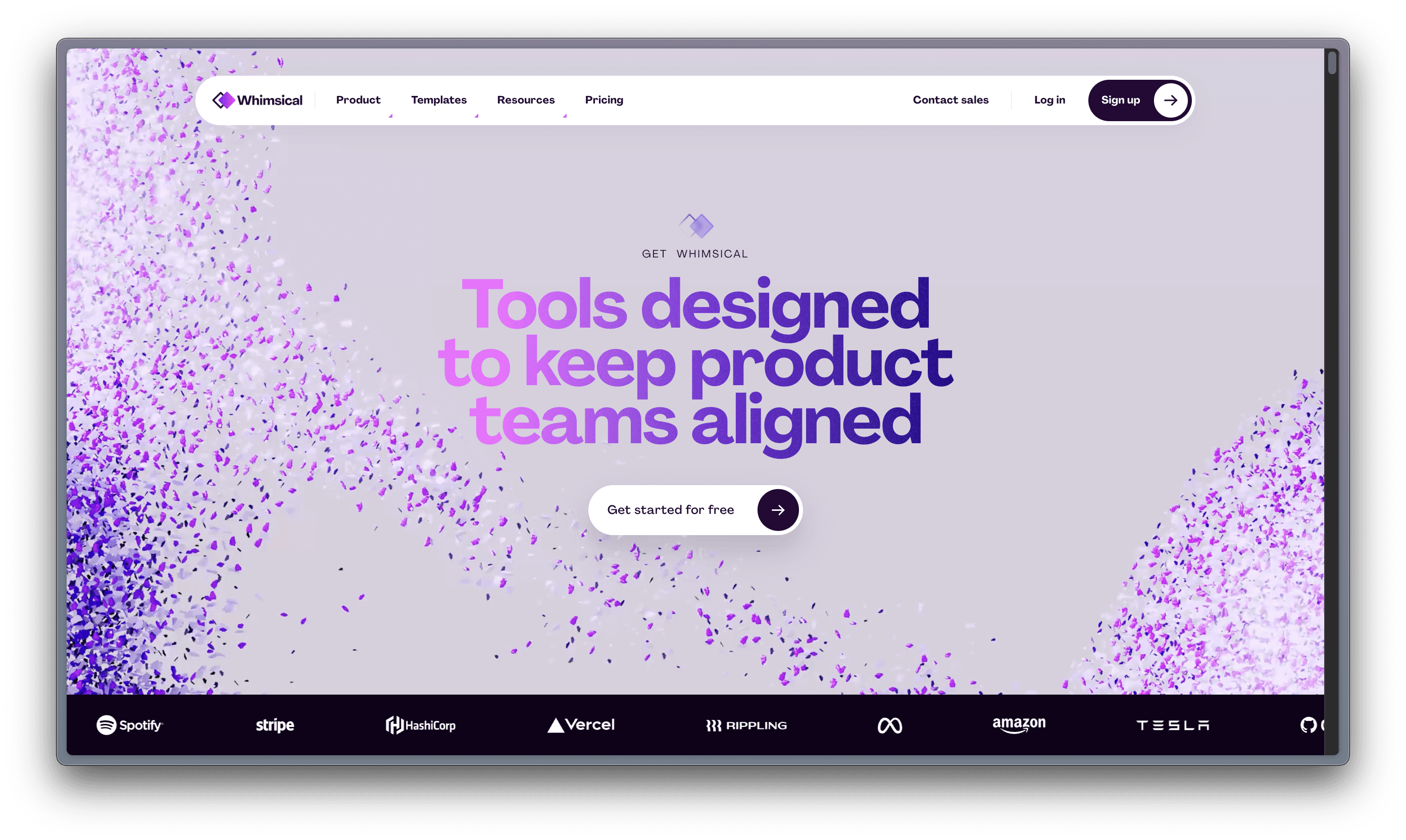
Whimsical
Work Better, Faster, Together: Whimsical combines whiteboards and docs in an all-in-one collaboration hub.
Some of the popular visual tools you may have heard of (or even tested) are:
Miro
A visual workspace for innovation that enables distributed teams of any size to dream, design, and build the future together.

Mural
More than just a whiteboard, Mural can be used to make every workflow more organized, fruitful, and productive.

Heptabase – requires a paid subscription
A note-taking tool for visual learning. Make sense of complex topics.

Milanote
Get organized. Stay creative. Milanote is an easy-to-use tool to organize your ideas and projects into visual boards.

Muse – only available for Apple products
Muse is a canvas for thinking that helps you get clarity on things that matter. Your tool for deep work on iPad and Mac.

Mindmeister
Collaborative Mind Mapping: It All Starts with an Idea.

Whimsical
Work Better, Faster, Together: Whimsical combines whiteboards and docs in an all-in-one collaboration hub.

Some of the popular visual tools you may have heard of (or even tested) are:
Miro
A visual workspace for innovation that enables distributed teams of any size to dream, design, and build the future together.

Mural
More than just a whiteboard, Mural can be used to make every workflow more organized, fruitful, and productive.

Heptabase – requires a paid subscription
A note-taking tool for visual learning. Make sense of complex topics.

Milanote
Get organized. Stay creative. Milanote is an easy-to-use tool to organize your ideas and projects into visual boards.

Muse – only available for Apple products
Muse is a canvas for thinking that helps you get clarity on things that matter. Your tool for deep work on iPad and Mac.

Mindmeister
Collaborative Mind Mapping: It All Starts with an Idea.

Whimsical
Work Better, Faster, Together: Whimsical combines whiteboards and docs in an all-in-one collaboration hub.

Some of the popular visual tools you may have heard of (or even tested) are:
Miro
A visual workspace for innovation that enables distributed teams of any size to dream, design, and build the future together.

Mural
More than just a whiteboard, Mural can be used to make every workflow more organized, fruitful, and productive.

Heptabase – requires a paid subscription
A note-taking tool for visual learning. Make sense of complex topics.

Milanote
Get organized. Stay creative. Milanote is an easy-to-use tool to organize your ideas and projects into visual boards.

Muse – only available for Apple products
Muse is a canvas for thinking that helps you get clarity on things that matter. Your tool for deep work on iPad and Mac.

Mindmeister
Collaborative Mind Mapping: It All Starts with an Idea.

Whimsical
Work Better, Faster, Together: Whimsical combines whiteboards and docs in an all-in-one collaboration hub.

Some of the popular visual tools you may have heard of (or even tested) are:
Miro
A visual workspace for innovation that enables distributed teams of any size to dream, design, and build the future together.

Mural
More than just a whiteboard, Mural can be used to make every workflow more organized, fruitful, and productive.

Heptabase – requires a paid subscription
A note-taking tool for visual learning. Make sense of complex topics.

Milanote
Get organized. Stay creative. Milanote is an easy-to-use tool to organize your ideas and projects into visual boards.

Muse – only available for Apple products
Muse is a canvas for thinking that helps you get clarity on things that matter. Your tool for deep work on iPad and Mac.

Mindmeister
Collaborative Mind Mapping: It All Starts with an Idea.

Whimsical
Work Better, Faster, Together: Whimsical combines whiteboards and docs in an all-in-one collaboration hub.

Infinite Spatial Canvas
When we are focused on writing and organizing our ideas at the same time, some fleeting thoughts or ideas that don’t fit neatly into a category can be lost along the way. Not all ideation is linear: and when it comes to taking complex notes that circuitously relate to each other, a visual note taking tool is more effective to capture this chaotic process and allow the user to engage in their stream-of-consciousness before distilling the information.
Various tools present this canvas in diverse ways. In Milanote, ideas take shape in columns or stacks, resembling a Kanban Board. Mural and Miro, on the other hand, prioritize creative diagramming using sticky-notes, reminiscent of a physical whiteboard or flashcards on a corkboard. Muse follows a similar diagrammatic approach as Mural but allows nested boards for delving into components of broad ideas in more detail. Mindmeister shares similarities with Scrintal in its arrow-connected mind-mapping, focusing more on short-form text for effective planning and organizing rather than ideation, featuring a Trello-like to-do list function. Heptabase closely mirrors Scrintal with long-form notecards, multimedia embeds, and arrow connections, though the manually dragged arrows in Heptabase's graph view lack the meaningful connections found in Scrintal. Both Heptabase and Scrintal offer a dark mode, but Scrintal stands out with collaborative features absent in Heptabase. Whimsical, a complex amalgamation of previous tools, combines diagrammatic capabilities, flowcharts, wireframes, mind-maps, Trello-like to-do lists, and even a document function. While Whimsical excels at visual representations of projects, it falls short for long-term, in-depth project materials.
Multimedia Capabilities
All of the listed tools have the capability to support at least one form of multimedia content, with images and videos being the most popular and PDFs being less common. Whether by uploading, pasting, or adding links, one of the key features of a useful note-taking app (and especially a visual one) is the ability to add content of all kinds into one place to avoid switching back and forth between tabs, and embedding media allows for this. With media embeds, you can enhance your ideation and project work.
Scrintal’s stand-out feature for media files is the ability to open any of them (image, video, PDF, or tweet) into a new “floating tab” that can be moved around the user’s desk or board at will, making it simple to navigate to another part of the board and still having the media file visible and accessible. However, all of these visual tools are capable of hosting files to allow for an interactive experience in a single ecosystem.
Scrintal’s Advantages
Personal Knowledge Management
With a personal knowledge management system, users can collect and create information to organize for more effective future use. A knowledge flow starts from ideation, then structuring the knowledge and finally sharing this knowledge; Scrintal covers this whole process. PKM sounds daunting because of the breadth and depth of potentially relevant information, but with Scrintal you can organize information as it appears and make connections between topics. You can also customize the visual display of this information: make clusters, trees, or intricate maps as needed, or dismiss and display notes as needed without losing the connections.
The ability to edit multiple notes at one time, even if they exist on different parts of one board, is a huge advantage Scrintal has over the other tools; this fully enables each user’s creative process without hindering it with navigation lags.
Connected Note Taking
All docs can be linked to each other with backlinks, which work exactly like the links between Wikipedia pages. It indicates a meaningful connection that exists across your entire knowledge base. Removing the visual indication of this by dismissing a doc from your board does not dissolve the connection; it will show up again if you bring that doc back to the board.
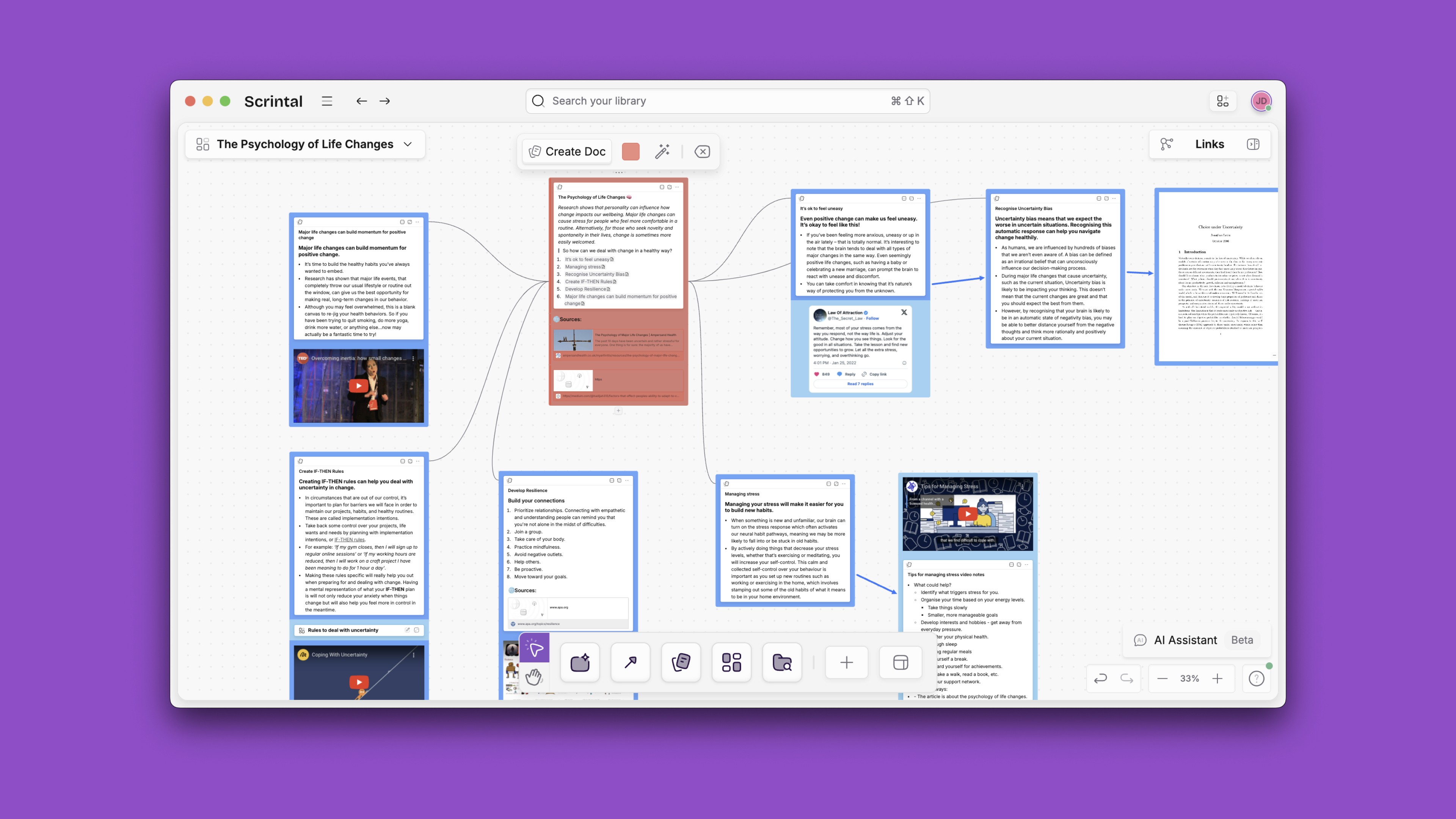
In Scrintal, you can also link to a doc that is not already present on the board, or you can link to an entire board, enabling ease of access during creative ideation. Unlike in Heptabase, which is the most similar tool to Scrintal, creating a backlink automatically creates the visual marker (an arrow), and creating a visual marker (dragging an arrow in the graph) creates a backlink automatically inside your note to indicate the connection between two cards. Many of the aforementioned tools utilize a similar mind-mapping function, but Scrintal supports text-heavy content, allows users to minimize, maximize, or dismiss docs, allows docs to exist on more than one board at once without having to recreate it, and has a floating tab system for multimedia files that increases the tool’s accessibility and convenience.
Intuitive User Experience
It is important to note that intuitiveness can be a characteristic that varies from user to user, and that only by testing each tool can we find out which will work best for us. As someone who has tested each of these tools, I’ll explain why Scrintal is the most intuitive for me: if you find yourself agreeing with or relating to my points, give Scrintal a try!
Scrintal is not bloated with features or cumbersome to navigate. The platform is intuitive, navigable with a few clicks or a quick parsing of the shortcut menu, the latter of which is composed of commands that are commonly used in the same way on other platforms. This means that casual users don’t have to deal with a steep learning curve and dedicated users can easily find resources to use Scrintal to its fullest capacity. While many other tools are less structured and allow the user to exercise more control and creativity, this also means more time spent learning functions and organizing a workspace; Scrintal does not have this issue. Even the language used to describe its features are intuitive and realistic: the desk is your everyday workspace, a board is a place to preserve a particular representation of your docs with specific connections in a visually permanent way, and a doc (like a flashcard) is where notes are taken. You can also create blocks like sticky notes for quick notes. The search function is useful for retrieving pieces of your knowledge base, and features like tags, color-coded notes, free text and Kanban style blocks help you organize information without getting too complicated.
Personal Knowledge Management
With a personal knowledge management system, users can collect and create information to organize for more effective future use. A knowledge flow starts from ideation, then structuring the knowledge and finally sharing this knowledge; Scrintal covers this whole process. PKM sounds daunting because of the breadth and depth of potentially relevant information, but with Scrintal you can organize information as it appears and make connections between topics. You can also customize the visual display of this information: make clusters, trees, or intricate maps as needed, or dismiss and display notes as needed without losing the connections.
The ability to edit multiple notes at one time, even if they exist on different parts of one board, is a huge advantage Scrintal has over the other tools; this fully enables each user’s creative process without hindering it with navigation lags.
Connected Note Taking
All docs can be linked to each other with backlinks, which work exactly like the links between Wikipedia pages. It indicates a meaningful connection that exists across your entire knowledge base. Removing the visual indication of this by dismissing a doc from your board does not dissolve the connection; it will show up again if you bring that doc back to the board.
In Scrintal, you can also link to a doc that is not already present on the board, or you can link to an entire board, enabling ease of access during creative ideation. Unlike in Heptabase, which is the most similar tool to Scrintal, creating a backlink automatically creates the visual marker (an arrow), and creating a visual marker (dragging an arrow in the graph) creates a backlink automatically inside your note to indicate the connection between two cards. Many of the aforementioned tools utilize a similar mind-mapping function, but Scrintal supports text-heavy content, allows users to minimize, maximize, or dismiss docs, allows docs to exist on more than one board at once without having to recreate it, and has a floating tab system for multimedia files that increases the tool’s accessibility and convenience.

Intuitive User Experience
It is important to note that intuitiveness can be a characteristic that varies from user to user, and that only by testing each tool can we find out which will work best for us. As someone who has tested each of these tools, I’ll explain why Scrintal is the most intuitive for me: if you find yourself agreeing with or relating to my points, give Scrintal a try!
Scrintal is not bloated with features or cumbersome to navigate. The platform is intuitive, navigable with a few clicks or a quick parsing of the shortcut menu, the latter of which is composed of commands that are commonly used in the same way on other platforms. This means that casual users don’t have to deal with a steep learning curve and dedicated users can easily find resources to use Scrintal to its fullest capacity. While many other tools are less structured and allow the user to exercise more control and creativity, this also means more time spent learning functions and organizing a workspace; Scrintal does not have this issue. Even the language used to describe its features are intuitive and realistic: the desk is your everyday workspace, a board is a place to preserve a particular representation of your docs with specific connections in a visually permanent way, and a doc (like a flashcard) is where notes are taken. You can also create blocks like sticky notes for quick notes. The search function is useful for retrieving pieces of your knowledge base, and features like tags, color-coded notes, free text and Kanban style blocks help you organize information without getting too complicated.
Personal Knowledge Management
With a personal knowledge management system, users can collect and create information to organize for more effective future use. A knowledge flow starts from ideation, then structuring the knowledge and finally sharing this knowledge; Scrintal covers this whole process. PKM sounds daunting because of the breadth and depth of potentially relevant information, but with Scrintal you can organize information as it appears and make connections between topics. You can also customize the visual display of this information: make clusters, trees, or intricate maps as needed, or dismiss and display notes as needed without losing the connections.
The ability to edit multiple notes at one time, even if they exist on different parts of one board, is a huge advantage Scrintal has over the other tools; this fully enables each user’s creative process without hindering it with navigation lags.
Connected Note Taking
All docs can be linked to each other with backlinks, which work exactly like the links between Wikipedia pages. It indicates a meaningful connection that exists across your entire knowledge base. Removing the visual indication of this by dismissing a doc from your board does not dissolve the connection; it will show up again if you bring that doc back to the board.
In Scrintal, you can also link to a doc that is not already present on the board, or you can link to an entire board, enabling ease of access during creative ideation. Unlike in Heptabase, which is the most similar tool to Scrintal, creating a backlink automatically creates the visual marker (an arrow), and creating a visual marker (dragging an arrow in the graph) creates a backlink automatically inside your note to indicate the connection between two cards. Many of the aforementioned tools utilize a similar mind-mapping function, but Scrintal supports text-heavy content, allows users to minimize, maximize, or dismiss docs, allows docs to exist on more than one board at once without having to recreate it, and has a floating tab system for multimedia files that increases the tool’s accessibility and convenience.

Intuitive User Experience
It is important to note that intuitiveness can be a characteristic that varies from user to user, and that only by testing each tool can we find out which will work best for us. As someone who has tested each of these tools, I’ll explain why Scrintal is the most intuitive for me: if you find yourself agreeing with or relating to my points, give Scrintal a try!
Scrintal is not bloated with features or cumbersome to navigate. The platform is intuitive, navigable with a few clicks or a quick parsing of the shortcut menu, the latter of which is composed of commands that are commonly used in the same way on other platforms. This means that casual users don’t have to deal with a steep learning curve and dedicated users can easily find resources to use Scrintal to its fullest capacity. While many other tools are less structured and allow the user to exercise more control and creativity, this also means more time spent learning functions and organizing a workspace; Scrintal does not have this issue. Even the language used to describe its features are intuitive and realistic: the desk is your everyday workspace, a board is a place to preserve a particular representation of your docs with specific connections in a visually permanent way, and a doc (like a flashcard) is where notes are taken. You can also create blocks like sticky notes for quick notes. The search function is useful for retrieving pieces of your knowledge base, and features like tags, color-coded notes, free text and Kanban style blocks help you organize information without getting too complicated.
Personal Knowledge Management
With a personal knowledge management system, users can collect and create information to organize for more effective future use. A knowledge flow starts from ideation, then structuring the knowledge and finally sharing this knowledge; Scrintal covers this whole process. PKM sounds daunting because of the breadth and depth of potentially relevant information, but with Scrintal you can organize information as it appears and make connections between topics. You can also customize the visual display of this information: make clusters, trees, or intricate maps as needed, or dismiss and display notes as needed without losing the connections.
The ability to edit multiple notes at one time, even if they exist on different parts of one board, is a huge advantage Scrintal has over the other tools; this fully enables each user’s creative process without hindering it with navigation lags.
Connected Note Taking
All docs can be linked to each other with backlinks, which work exactly like the links between Wikipedia pages. It indicates a meaningful connection that exists across your entire knowledge base. Removing the visual indication of this by dismissing a doc from your board does not dissolve the connection; it will show up again if you bring that doc back to the board.
In Scrintal, you can also link to a doc that is not already present on the board, or you can link to an entire board, enabling ease of access during creative ideation. Unlike in Heptabase, which is the most similar tool to Scrintal, creating a backlink automatically creates the visual marker (an arrow), and creating a visual marker (dragging an arrow in the graph) creates a backlink automatically inside your note to indicate the connection between two cards. Many of the aforementioned tools utilize a similar mind-mapping function, but Scrintal supports text-heavy content, allows users to minimize, maximize, or dismiss docs, allows docs to exist on more than one board at once without having to recreate it, and has a floating tab system for multimedia files that increases the tool’s accessibility and convenience.

Intuitive User Experience
It is important to note that intuitiveness can be a characteristic that varies from user to user, and that only by testing each tool can we find out which will work best for us. As someone who has tested each of these tools, I’ll explain why Scrintal is the most intuitive for me: if you find yourself agreeing with or relating to my points, give Scrintal a try!
Scrintal is not bloated with features or cumbersome to navigate. The platform is intuitive, navigable with a few clicks or a quick parsing of the shortcut menu, the latter of which is composed of commands that are commonly used in the same way on other platforms. This means that casual users don’t have to deal with a steep learning curve and dedicated users can easily find resources to use Scrintal to its fullest capacity. While many other tools are less structured and allow the user to exercise more control and creativity, this also means more time spent learning functions and organizing a workspace; Scrintal does not have this issue. Even the language used to describe its features are intuitive and realistic: the desk is your everyday workspace, a board is a place to preserve a particular representation of your docs with specific connections in a visually permanent way, and a doc (like a flashcard) is where notes are taken. You can also create blocks like sticky notes for quick notes. The search function is useful for retrieving pieces of your knowledge base, and features like tags, color-coded notes, free text and Kanban style blocks help you organize information without getting too complicated.
Personal Knowledge Management
With a personal knowledge management system, users can collect and create information to organize for more effective future use. A knowledge flow starts from ideation, then structuring the knowledge and finally sharing this knowledge; Scrintal covers this whole process. PKM sounds daunting because of the breadth and depth of potentially relevant information, but with Scrintal you can organize information as it appears and make connections between topics. You can also customize the visual display of this information: make clusters, trees, or intricate maps as needed, or dismiss and display notes as needed without losing the connections.
The ability to edit multiple notes at one time, even if they exist on different parts of one board, is a huge advantage Scrintal has over the other tools; this fully enables each user’s creative process without hindering it with navigation lags.
Connected Note Taking
All docs can be linked to each other with backlinks, which work exactly like the links between Wikipedia pages. It indicates a meaningful connection that exists across your entire knowledge base. Removing the visual indication of this by dismissing a doc from your board does not dissolve the connection; it will show up again if you bring that doc back to the board.
In Scrintal, you can also link to a doc that is not already present on the board, or you can link to an entire board, enabling ease of access during creative ideation. Unlike in Heptabase, which is the most similar tool to Scrintal, creating a backlink automatically creates the visual marker (an arrow), and creating a visual marker (dragging an arrow in the graph) creates a backlink automatically inside your note to indicate the connection between two cards. Many of the aforementioned tools utilize a similar mind-mapping function, but Scrintal supports text-heavy content, allows users to minimize, maximize, or dismiss docs, allows docs to exist on more than one board at once without having to recreate it, and has a floating tab system for multimedia files that increases the tool’s accessibility and convenience.

Intuitive User Experience
It is important to note that intuitiveness can be a characteristic that varies from user to user, and that only by testing each tool can we find out which will work best for us. As someone who has tested each of these tools, I’ll explain why Scrintal is the most intuitive for me: if you find yourself agreeing with or relating to my points, give Scrintal a try!
Scrintal is not bloated with features or cumbersome to navigate. The platform is intuitive, navigable with a few clicks or a quick parsing of the shortcut menu, the latter of which is composed of commands that are commonly used in the same way on other platforms. This means that casual users don’t have to deal with a steep learning curve and dedicated users can easily find resources to use Scrintal to its fullest capacity. While many other tools are less structured and allow the user to exercise more control and creativity, this also means more time spent learning functions and organizing a workspace; Scrintal does not have this issue. Even the language used to describe its features are intuitive and realistic: the desk is your everyday workspace, a board is a place to preserve a particular representation of your docs with specific connections in a visually permanent way, and a doc (like a flashcard) is where notes are taken. You can also create blocks like sticky notes for quick notes. The search function is useful for retrieving pieces of your knowledge base, and features like tags, color-coded notes, free text and Kanban style blocks help you organize information without getting too complicated.
Visual Note-Taking Tools Alternative: The Final Verdict
Scrintal is the most complete visual note taking option
After reading this guide, you can choose the software that suits best your needs and tastes. As a visual thinker myself, Scrintal is a great alternative to mindmapping, whiteboards and other visual tools.
Scrintal serves researchers, advanced students, executives, entrepreneurs, consultants, authors, software developers, and anyone tackling complex topics. Our platform empowers users to capture and connect ideas visually, simplifying complex thoughts and enabling persuasive content creation. Scrintal offers a zero-learning curve, immediate productivity, and structured knowledge accessibility. Scrintal stands out for its simplicity and unique features, making creative thinking and knowledge management effortless.
If you’re a visual learner as I am, then give Scrintal a try and see how you like it!

Isha Trivedi
Unlock brilliance
Company
Guides
Comparisons
Unlock brilliance
Company
Guides
Comparisons
Unlock brilliance
Company
Guides
Comparisons