Heptabase Alternative: Scrintal Visual Note Taking App

Become a Visual Thinker

Heptabase Alternative: Scrintal Visual Note Taking App

Become a Visual Thinker

Heptabase Alternative: Scrintal Visual Note Taking App

Become a Visual Thinker

Which knowledge base to use as a visual learner and thinker?

We started receiving the question “How does Scrintal and Heptabase differ?” more often as more people got to learn about Scrintal lately.

Based on the 55.000+ people joining our waitlist, and 5.000+ paying customers, it is clear that many people want to think and work more visually, but the existing solutions do not help them get a bird-eye overview of their ideas or projects.

What happens then?

People spend less time doing creative work, project delivery times get extended, and 90% of the raw ideas become meaningless in information silos without context.

This is a complete productivity killer for some people.

If you are a visual thinker, there are now two new visual knowledge management apps that can come to your rescue: Scrintal and Heptabase.

Even though the two products look similar from the outside, they offer quite different user experiences when you start working on them.

I wanted to highlight some of the main differences between Heptabase and Scrintal to help you in your decision-making process.

Disclaimer: This is not an article to pamper Scrintal and tell how it is better from Heptabase. In fact, Hepta has been developed for almost a year longer than Scrintal so it naturally offers more features at the moment.
I will try to be as objective as I can be with respect to their young team that seems to be working very hard to have success with their startup, just like us.

1. Web app vs. Desktop App

Scrintal is a web application that also offers desktop apps at the moment. The fact that it is web-based allows the user to use Scrintal on a tablet or mobile browser.

To use Hepta, you have to download a desktop app to your computer.

I believe these differences won’t matter much in the future because both teams will develop their own native and web apps.

2. Live Collaboration

One of our goals at Scrintal is to build better-functioning teams and help them gain a shared understanding by minimizing feedback loops.

In line with that goal, even the early version of Scrintal allows simultaneous collaboration, and our product roadmap includes collaborative elements.

So they can ideate and develop ideas together, share common workspaces to avoid information silos. Heptabase currently works as a single-user product.

3. Data safety

Scrintal works on the cloud. From the first day, we favoured this approach because we champion accessibility from anywhere and anytime. People can export their work to their computers and store it locally.

To ensure access “anytime,” we’ll enable an offline mode that allows working even where there is no internet connection (e.g. while traveling, in remote locations). The system will sync as soon as the internet connection is back.

The development of a mobile app will also support accessibility from anywhere, anytime. It's worth mentioning that while we currently don't have a dedicated mobile app, Scrintal is fully operational on both phones and tablets through your web browser.

In contrast, Heptabase operates offline on a local device, providing users with the option to sync notes in the cloud. This approach offers a different level of control over your data and accessibility.

Our thoughts on data ownership

The way we think about data ownership includes data safety and data portability. We believe you should be able to access and use your data wherever you want, on whichever device without any hassle in today’s world.

Doing that requires utilizing what the latest cloud service technologies have to offer — of course in a secure way. We process all personal data in accordance with the General Data Protection Regulation (EU) 2017/676 (“GDPR”) and other applicable data protection rules. We believe security concerns should not curtail the opportunities presented by cloud systems and should be addressed seriously by the product teams.

Our co-founder, Ece graduated with a PhD last year so we know pretty well how important it is to ensure data security as a company. This is why we took extra measures to do just that.

4. Design Philosophy

I believe this is where the biggest difference lies. In Scrintal, each card is an entity of its own. You can think of cards similar to a page in Notion.

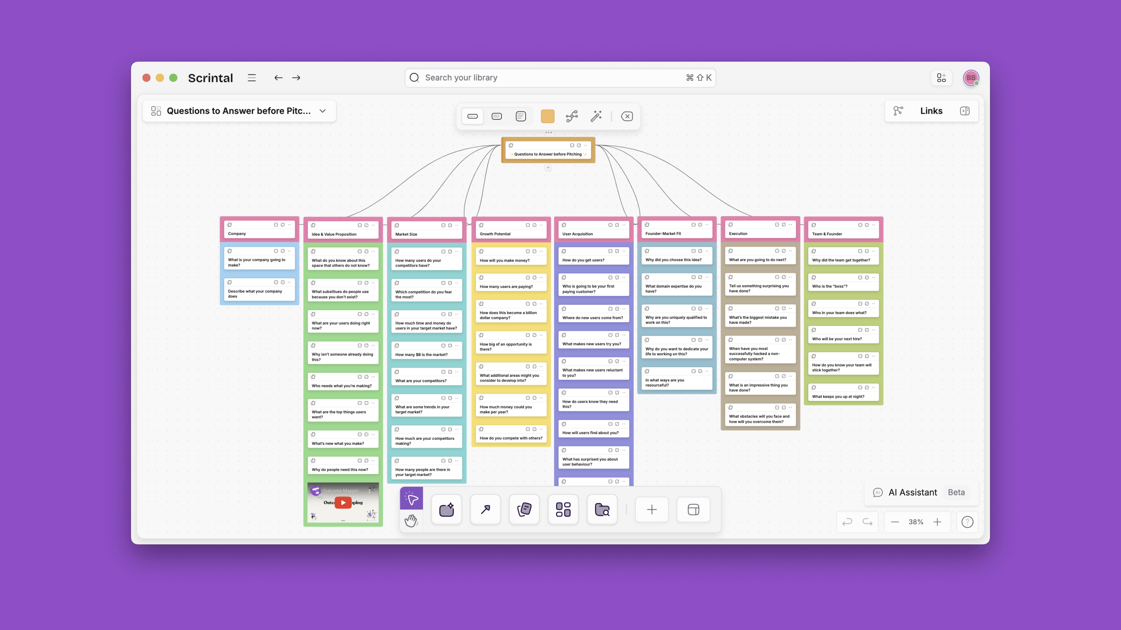
Once created, cards can be linked with other cards via links (similar to Obsidian), and each connection is visualized automatically on the whiteboard once the link is established.

This means the arrows between cards are actual links automatically drawn. This automatic way of connecting cards saves time when creating visual representations.

Heptabase doesn’t automatically show bidirectional links on boards but only allows you to manually draw arrows between cards without linking them. While this helps visualize connections on the surface, it doesn't establish the same structural relationships as Scrintal's automatic bidirectional links.

This is a difference in our approaches. I kind of like the idea of having the ability to draw “temporary” arrows because it can help in the very early stages of fast ideation.  In Scrintal, I also draw and remove the links in the graphs between cards with much more flexibility and liberty, but I must admit that when the ideation stage ends, and more specific work needs to be done, the backlinks inside the notes are really handy; especially to retrieve information later on when the cards are not on display. In Heptabase, although backlinks can be added within cards, they lack the visual representation seen in Scrintal's whiteboard view. This can be perceived as unnecessary friction, as users may find themselves needing to perform double work.

Since there is only one workspace where all cards are stored, you can bring a card to any board (i.e. project) you’re working on. This avoids duplication and enables reusing the same card across different projects in your knowledge base. Such design philosophy differs these tools from other online whiteboards such as Miro.

You create a card on the board where you see everything at a glance. You can open and write in multiple cards at the same time in one screen.

5. Media and PDF Embeds

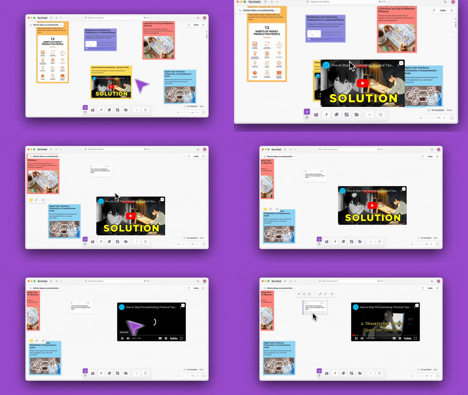
If there is any media or image embedded, you can pop that out of the card, and consume the content while taking notes simultaneously somewhere else in your knowledge base. That means you’re not limited to only a single page. One of Scrintal's differentiations is extracting any type of media and PDFs from a card.

6. User Interface

This part is subjective, there is no right or wrong, better or worse. Two products adopt different user interfaces. It is really a matter of choice as to what you prefer as an individual. The user interface plays a pivotal role in shaping the overall user experience of any knowledge management tool.
Heptabase's interface impresses with its sleek design and engaging typewriter animation during onboarding, creating an immersive initial experience. However, the gradual reveal of text throughout the onboarding process may extend its duration, and the focus of this introduction leans more towards knowledge management concepts than practical app navigation. It emphasizes Heptabase's role in breaking down complex projects into manageable pieces on a whiteboard, promoting improved review and comprehension.

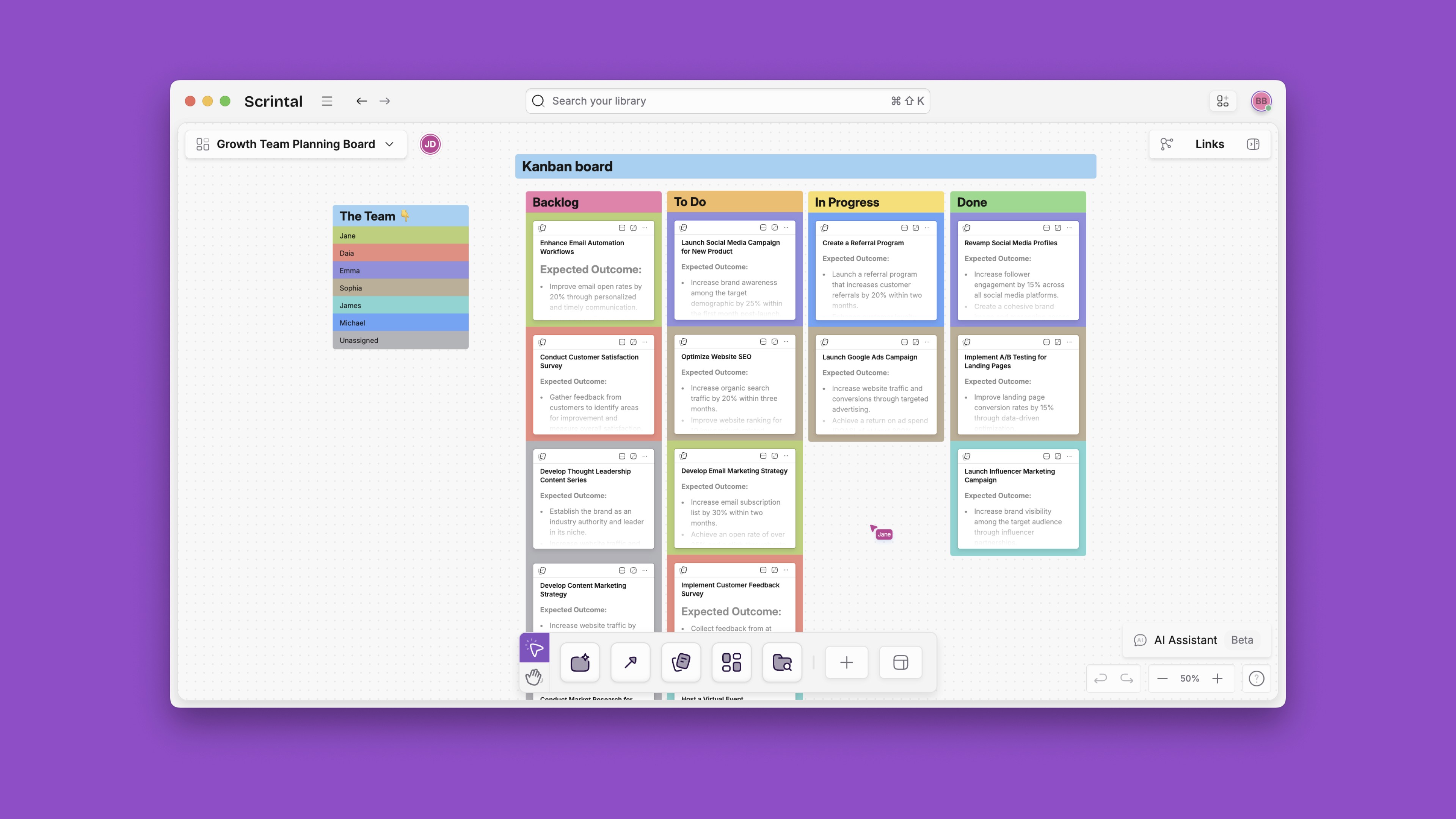
In contrast, Scrintal's UI prioritizes usability and navigational clarity. A dedicated sidebar streamlines access to crucial views, enhancing overall organization. Scrintal's "My Desk" button allows you to access your workspace effortlessly. The sections in the sidebar "Cards" and "Boards," make navigation a breeze, and the structured menu bar has breadcrumbs for easy orientation. Scrintal UI facilitates quick actions for efficient card management and a refreshed design language with updated icons and a modern color palette. This emphasis on user-friendliness and efficient navigation positions Scrintal as a tool for visual thinkers and knowledge managers.
7. Dark mode 😎

God damn you dark mode!!! This was probably one of the most asked features in our community and at some point it became a thing in our team so I had to put it here 😂
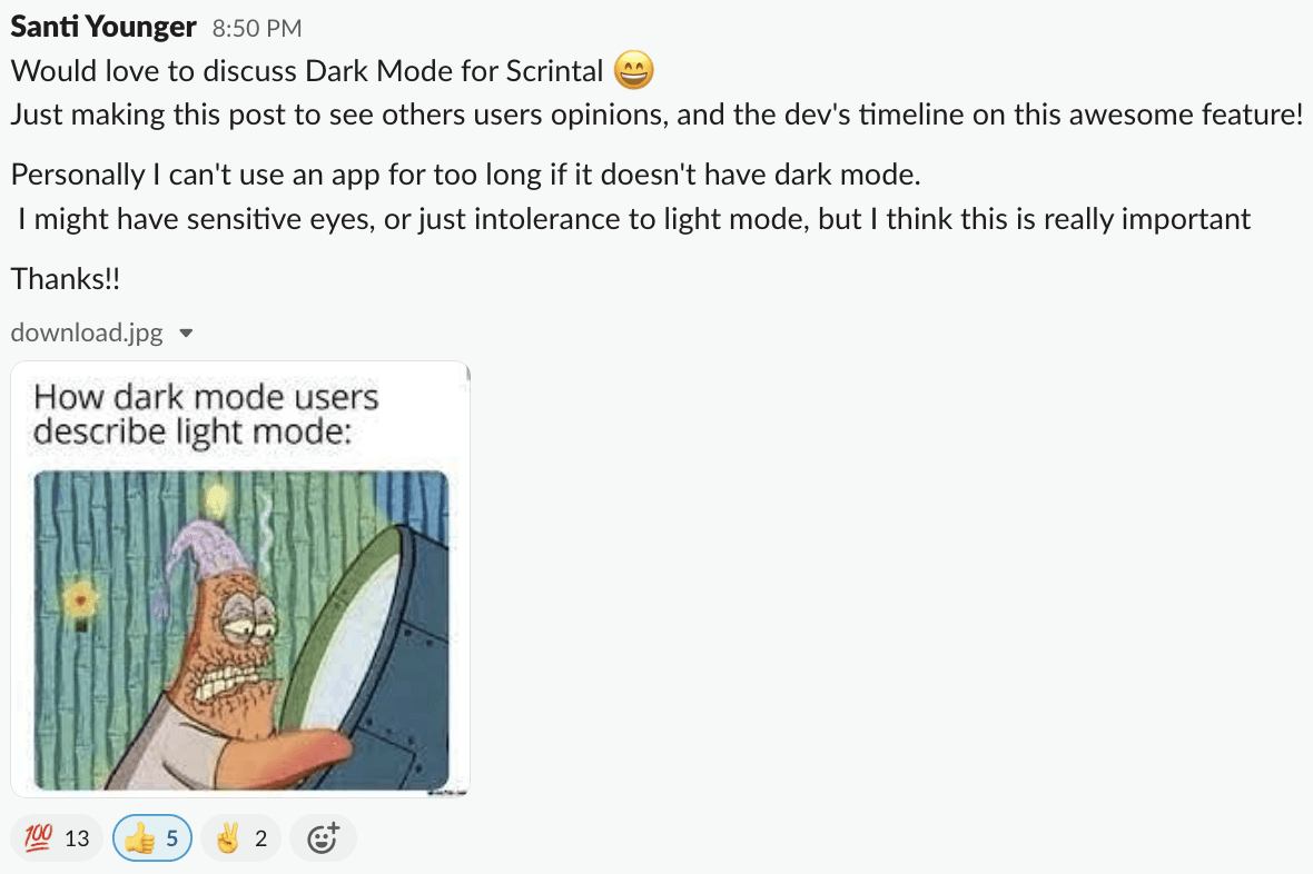
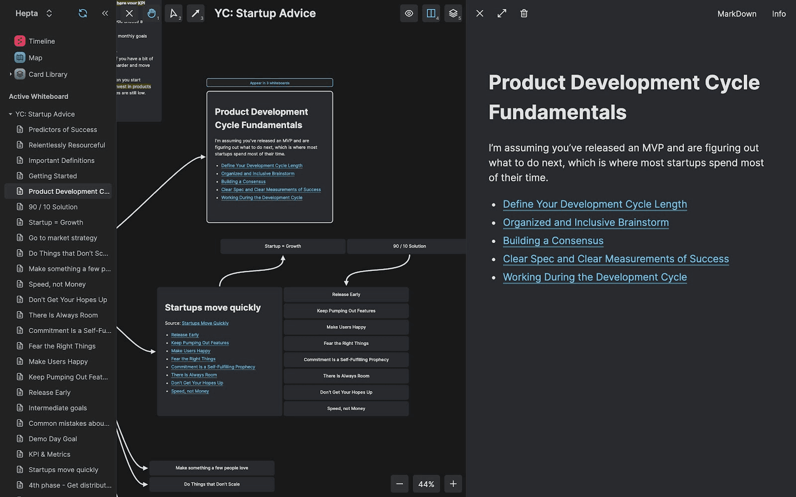
Below you can see our dark mode as well as Heptabase’s.
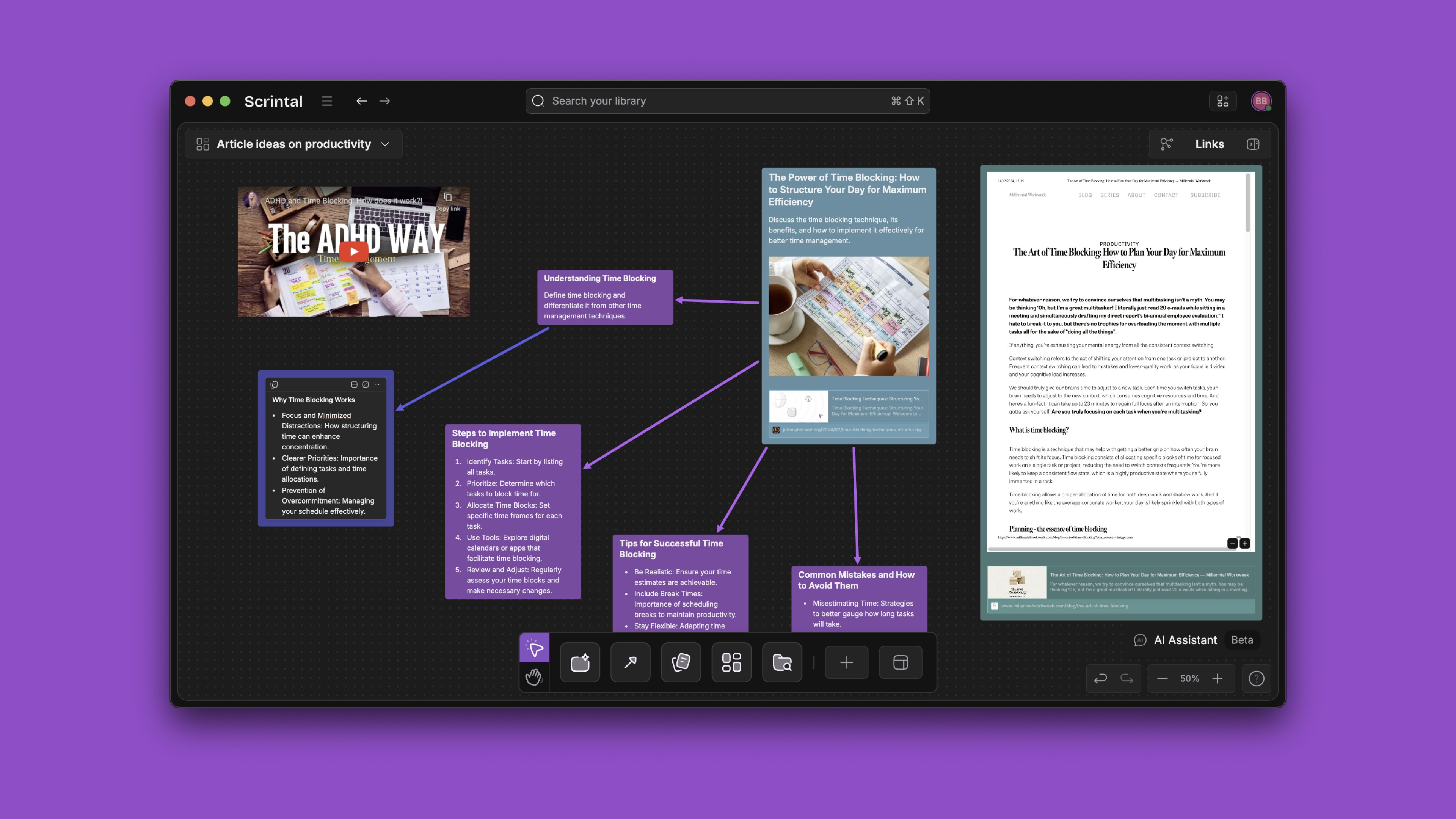
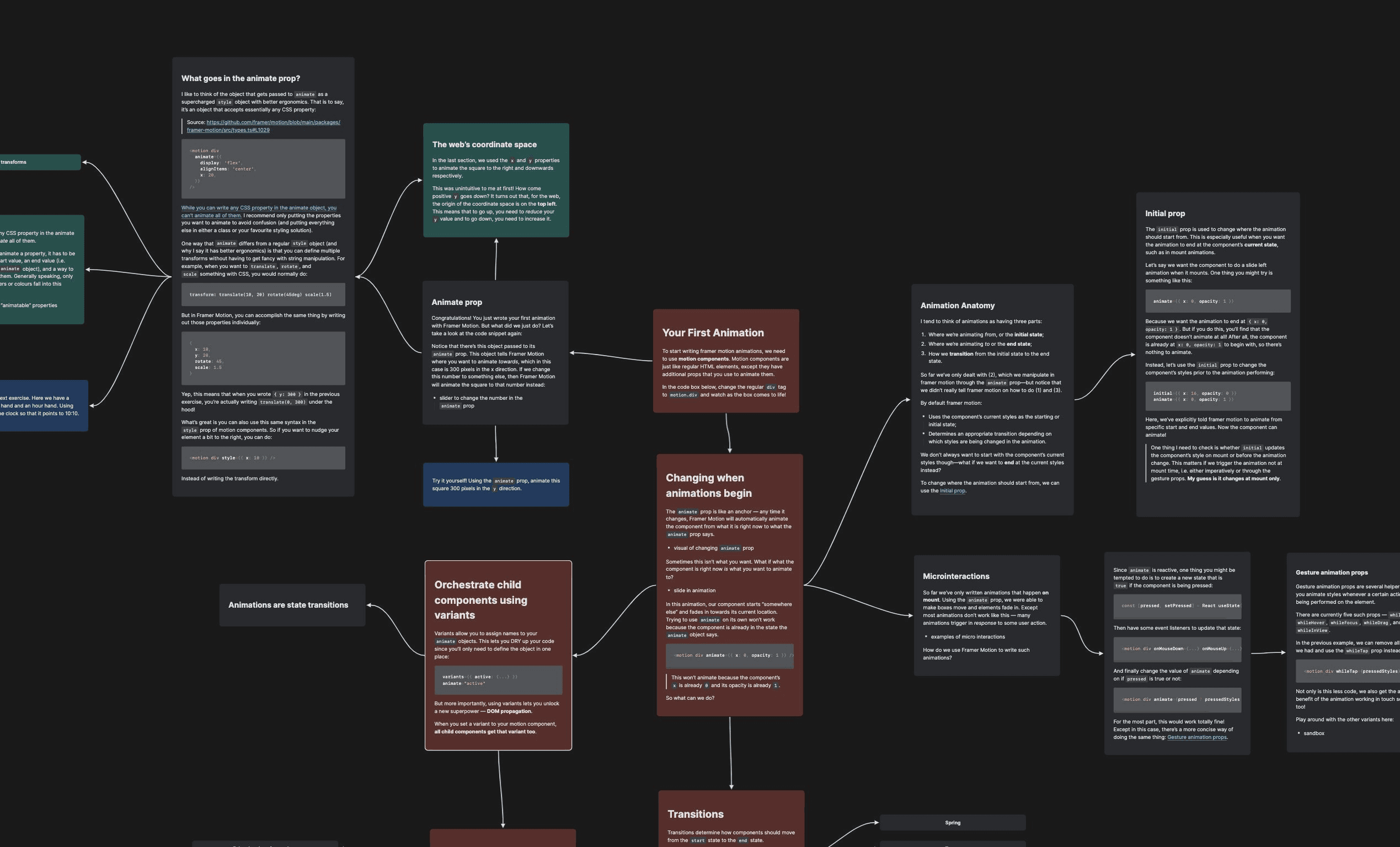
Moreover, we've got something cool for our users who really dig visuals and like to keep things neat – different grid options and card alignments. These features help them keep their cards tidy and organized.

8. User Centricity

Both teams have adopted a user-centric approach that takes into account users’ feedback and suggestions seriously when it comes to product development. (Check our roadmap and user feedback here.)

I know the Scrintal team approach is pretty much appreciated by the users and set us apart from many other big companies, but the Hepta team is following a similar approach so I don't think there is a major difference here.

9. Pricing

Both products offer a yearly plan at the time this article was written. We have our early-access Personal Pro plan at $60/year. While Heptabase offers their yearly plan for $107.88/year. 

Scrintal also offers a Lifetime plan for $239 (one-time payment), while Heptabase recently introduced a Monthly Plan for $11.99/month.

Additionally, we're consistently fine-tuning our pricing to align with local economies, making Scrintal accessible to users worldwide, regardless of their location. So, check if local pricing options are available in your country.

You can read our reasoning behind deciding our price in this article here.

Anything else?

There are of course differences, and as I said above, Heptabase is currently offering more functionalities given their longer development time – without undermining their teams’ hard work.

But over time, it is likely that both products will offer more similar features but keep differentiating on the design philosophy and who they target as their main user base.

The target user decision will determine which type of features and integrations they will build and how the products will evolve over time.

Moment of Truth: Scrintal or Heptabase?

So what should you do? Hard to tell huh?

To be honest, I believe these are two strong products with huge development upsides.

Heptabase looks like a great product with a young, hardworking team behind it. As an early-stage startup worker and enthusiast, knowing how difficult it is to build a sustainable business from scratch, I can only respect their efforts. It doesn’t really matter even if they are ‘competitors’.

In terms of company vision, I can only speak on behalf of the Scrintal team. We have a clear mission to empower people’s visual creativity, so they convert their cluttered ideas into meaningful outcomes. Our approach tries to harmonize the dynamic nature of idea generation with the precision of knowledge organization.

Scrintal will continue to evolve along the “think > develop > share” axis which means you will turn a raw idea into a full-fledged output in one place.

So I’ll advise you to go with your gut feeling and choose the one that feels closer to you. Or maybe both? It is really a matter of choice at this point.

This page is outdated and currently under construction 🚧 Please visit the new Scrintal homepage for up-to-date information.

This page is outdated and currently under construction 🚧 Please visit the new Scrintal homepage for up-to-date information.